With plenty of ab testing ideas guidelines in the pool of marketing and optimization options, figuring out what to test is more complex than ever.
There are so many factors necessary in making a split-test experiment successful, and because there are so many guides with tons of ideas based on the most common A/B testing experiments for retail sites, the strategic aspect of choosing the most important A/B test experiment to e-commerce often gets lost in the selection process.
In other words, it’s hard to even choose a test — let alone to set it up strategically.
Before you can even get started, you need to understand your optimization requirements and what you want to achieve from the test.
To know that, you need to explore the problem areas of your website, including landing pages, navigation, and more.
Then — because there are so many aspects of your site that may need testing— instead of deciding what to test, you must choose what to test first. It can be a real struggle to filter it down to that one idea that has enough potential to stir up revenue.
Also, You may have an additional problem if you don’t know whether you have the resources to implement the technicality of the desired test.
And there are so many kinds of tests to choose from!
In this article, we’ve separated out the types of experiments as follows:
- A/B test experiment ideas for personalization
- A/B test ideas for landing pages
- A/B test ideas for the checkout page
- Split-testing ideas for mobile site optimization
Having a theory about why your users are not converting to customers is the best way to have a good approach while choosing an ideal test to start the optimization journey.
Here, we discuss a few of those conversion concerns, which could be resolved by opting for A/B testing and experiment ideas for e-commerce based on: the categories of tests, the basic process of testing, split testing tools recommendations, and strategies for completing testing.
Increase User Engagement Through Personalization
For any e-commerce business to sustain itself in the long run, it needs a consistent audience. And it’s easy to know if that’s the case with your audience or not.
One way to know this is if the number of new visitors to your website is far greater than the number of returning visitors; then there’s a chance you’re not convincing your users to be consistently interested in your products or services. One way to tackle that could be personalization, which can encourage your user to convert by providing an excellent user experience individually.
In a survey by Accenture, they found that “75% of consumers are more likely to buy from retailers that have personalized content for them.”
These are signs that could be positive enough for you to give e-commerce personalization a try. If your analytical reporting points in that direction, then personalization may be the answer for you.
Personalization has many subcategories, and you can even connect it with your analytics to target your audience more accurately. Here are two ideas you can try right now:
Test Idea #1: Personalize Categories on Your Homepage
If a user recognizes your page by name, they are likely to land on the homepage. The homepage is also where all your promotions are presented. You can simplify or customize the categories shown per the user’s last visit to target their specific interests and tastes.
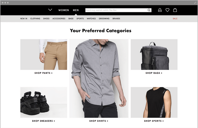
Source: Evergage
From the same Accenture study, they point out that “almost 40% of online consumers have abandoned a retailer’s website because of overwhelming choice of options.”
This may not apply to websites that offer relatively less items for sale. But for sites such as Amazon, with thousands of products to showcase, it becomes a necessity for them to choose what to show. That’s why Amazon nails personalization.
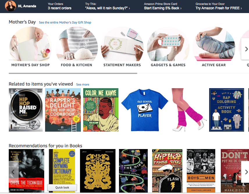
Source: Hubspot
After the first visit, they process the previous history of the user to customize the homepage each time accordingly. This serves the purpose of personalization perfectly. It’s the same approach often used by streaming sites like Netflix and YouTube.
Test Idea #2: Recommendation Engine
A recommendation engine is a great system for connecting with your users by providing them more than just goods. This way, businesses can present recommendations to every user based on their previously stored data history.
It’s a simple way to sell products in a more personal way without being physically present.
Some examples include:
- Related products under category pages
- Products bought together
- “You may also like” suggestions.
Here’s an example from Amazon:
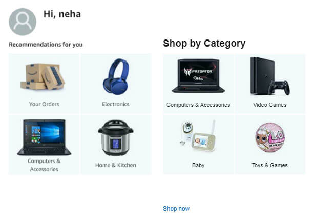
The reason we present this as a test idea here is because you never know if your user will like that approach or not. A/B testing verifies that for you.
For more help, check out our guide on how to implement a recommendation engine with the help of A/B testing.
Decrease Bounce Rates With Better Landing Pages
One of the most common issues with boosting traffic is that if it’s not converting, then it’s probably also increasing your bounce rate. It’s important to captivate the user by presenting products and promotions so they’ll eventually convert.
That’s why it’s important to have good A/B test ideas for landing pages.
Here are a few solutions for decreasing bounce rates:
Test Idea #3: Shortening Email Pop-Up Copy
G2 is a user review website. They conducted a survey to find out if people really hate email pop-ups. The results proved the theory correct:
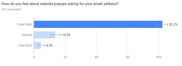
Source: G2
It’s not ideal to totally cut off pop-ups from your website, as then you won’t have as many subscribers to promote your marketing campaigns to.
If you do see your users running away because of them, then there are many ways to deal with that.
You can tackle this by running experiments which implement:
- Interactive pop-ups
- Shortening the size of the pop-up
- Replacing the full-size pop-up with a smaller pop-up.
For example, replace this:
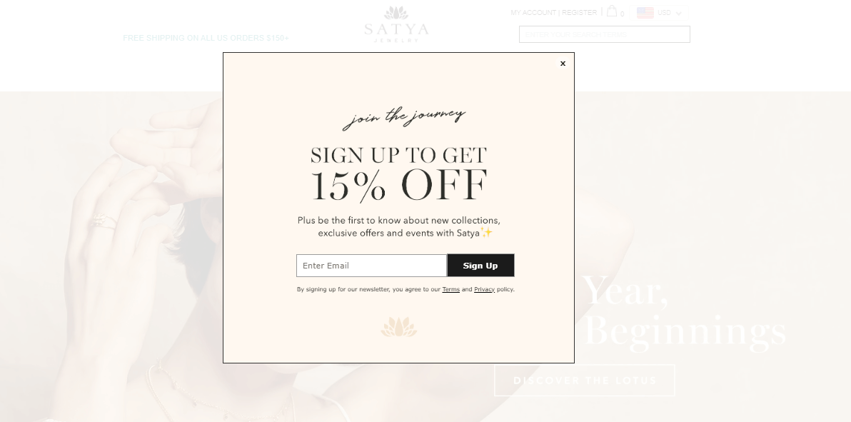
Source: Satya Jewelry
With this:
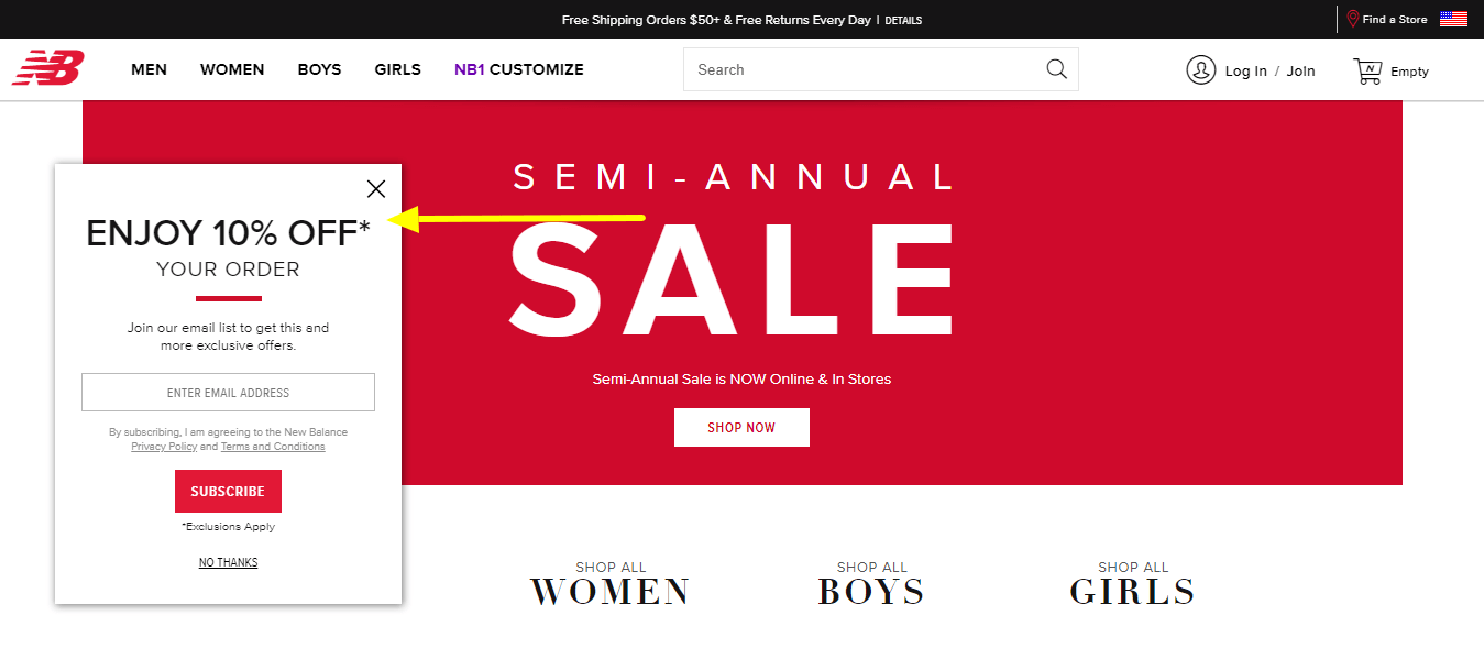
Source: New Balance
Or vice versa, but know what works best for your site. This is exactly why A/B testing and experiments exist.
Test Idea #4: Minimize the Number of CTAs on One Landing Page
A clear call to action makes it easy for the user to click on it, but too many CTAs can make the user confused about which one to click. When various options are presented, it can become an obstacle and cause friction that could cause navigation blockage.
An overwhelming amount of calls to action could leave the user clicking on nothing.
Source: Wordstream
This section is the perfect example of a confusing page with too many options. It may have been necessary to give users some options, but trying to use too many CTAs when one or two may have been enough can divert the user from the information and keep them from clicking at all.
Testing makes it clear exactly how many you should have for optimal conversions numbers.
Test Idea #5: Declutter Landing Pages With a Leaner Layout
Landing pages should be pleasing to the eye but also direct. It becomes hard for users to focus on the key theme of a website when there’s too much to look at. In a case study by Leonardo, they presented how an updated layout can make a landing page much more presentable:
Source: Leonardo
They revamped the whole site and a few main sections per researched user behavior. The new design beat the original version by using less content and more images.
Reduce Abandoned Carts With Improved Checkout Processes
According to a list compiled by Baymard Institute, the average cart abandonment rate is 69.57%. “It is claimed that the best optimized checkout process has an abandonment rate of 20%.” That’s because the process from putting an item in the cart to it being purchased often has so many steps that some of them end up being friction points. These include high shipping charges, a lengthy sign-up, long copy form, less payment options, and more, all of which can result in high abandoned cart rates.
Having the right A/B test ideas for checkout processes can help reduce that rate. Initially per the checkout funnel, you can bundle up the pages involved and optimize them one by one. Multivariate or multi-page testing could also be considered in these cases, as they all are interconnected.
It’s also necessary to keep optimizing these pages to be better and observe them thoroughly to lower cart abandonment as much as possible, especially since they can make or break conversions.
Test Idea #6: Optimize Guest Checkout vs. Login Checkouts
A specific reason 34% of shoppers abandon checkout is because they are forced to create an account.
People turn to online shopping because everything is just one click away. When you remove that ease by making them enter long details about themselves, it can really annoy them. They don’t want to create more new accounts and will always avoid it if given the chance.
Guest checkout is an option to try if users leave when asked to sign up.
Even though guest checkout looks like an ideal option, it does restrict you from increasing promotions and newsletter subscribers. Because there may be more benefits to having subscribed, repeat customers than one-time purchasers, it’s always better to run an A/B test experiment to test it out first.
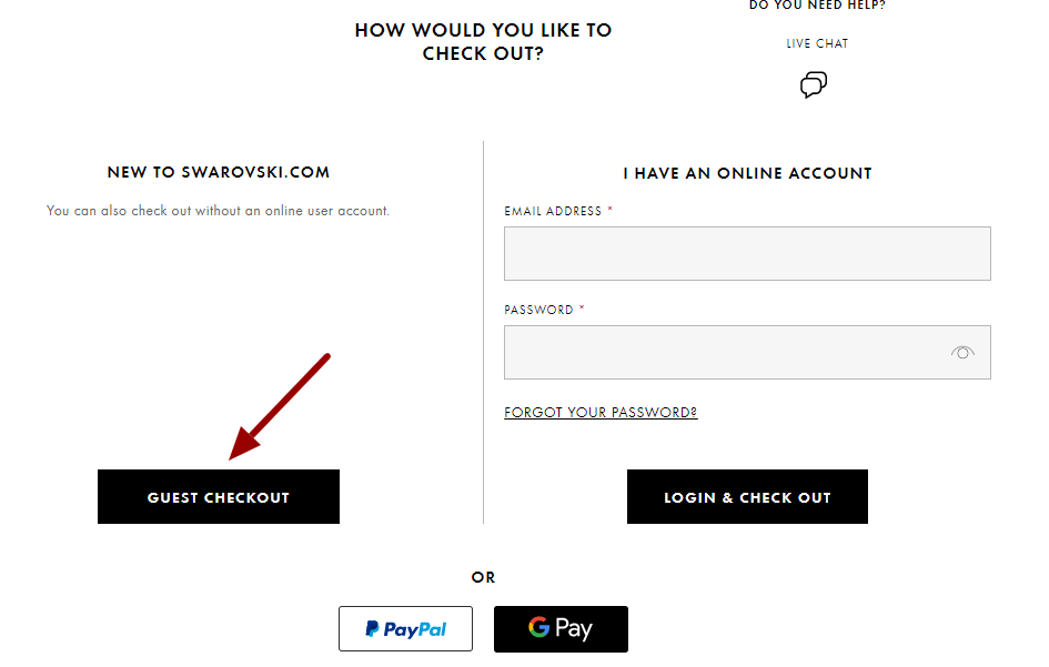
Source: Swarovski
Increase Mobile Conversion Rates With Mobile Split Testing
E-commerce sites often use social media ads as a source of traffic, and social media users are much more active on mobile than on desktop, which increases mobile traffic to your site. Having a good source of traffic and still not having decent conversion rates on mobile (by comparison to your desktop site) can mean a huge conversion funnel blockage.
It could simply mean that your mobile site is not strong enough. After enough observations and data analysis, you should be able to conclude whether that is the case or not.
Having well-researched mobile site split-testing ideas for optimizing your mobile site is an important part of improving conversion rates.
Test Idea #7: Leaner Mobile Site Homepage
Mobile sites have less space to present content, so it’s better to offer things in a short and clean manner. Otherwise, you may lose visitors before they ever see your CTA. Homepages shouldn’t be crowded with too many products. Many different kinds of categories means many different target audiences, but viewers may just want to purchase one particular item. Instead of showing everything, focus on navigating the right target product onto the page.
Fenty Beauty is a great example of having a clean yet appealing homepage, which interacts with the user without confusing them.

Source: Fenty Beauty
A cleaner design like this is great for websites that offer visually appealing items. It also depends on the brand and style your business maintains, as every audience is different and your user may or may not like it. That’s why it’s necessary to test instead of just applying changes without experiments.
Test Idea #8: Size of the CTA on Mobile Sites
A new user will take only seconds to choose whether to scroll down your site or not. The first thing they see is your hero section, which usually includes banners with offers and a CTA. Aim to make them click on that CTA in the fewest seconds possible, because you don’t want them to leave before they even get to it. The CTA is the ultimate thing on your site whose main motive is to get clicks and drive revenue. So if your mobile audience can’t see your “Shop now” properly, how will they shop?
You may also want to test your CTA’s size, color, font, button, or link text.
For example, H&M features this sale promotion without using any image, which makes it a very direct CTA.
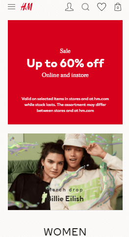
Source: H&M
Mobile sites have smaller areas to work with, and with smartphones’ touch systems, it’s necessary to make the process as smooth as possible. That’s why CTA size and design matter — otherwise, users may leave if they find it too difficult to click on the CTA or buttons.
A/B Testing Tools for E-commerce Optimization
We would like to recommend a few tools in case you are just starting with optimization or looking for a transition.
To start with an A/B test, you need a hypothesis, goals, and most importantly, a tool to set up an experiment on.
Some A/B testing tools are category specific and based on the type of tests, such as personalization or split testing; for example, dynamic yield.
Some are available for specific platforms such as Shopify, Wix, etc. This includes tools such as Shogun.
A few are page specific, such as product page optimization or landing page A/B testing — for example, Neat A/B Testing and Unbounce, respectively.
Other than these, there are some great split-testing tools which can do it all, including as Optimizely, A/B Tasty, and others. Additionally, sites such as VWO and Adobe Target feature add-ons such as heatmaps and Adobe Creative Cloud, respectively. And if you don’t want to spend too much, the free experimentation tool Google Optimize is a great option for beginners.
For more details about the best A/B testing optimization tools, check out our article on the 8 best A/B testing tools in 2020.
Conclusion
The first step towards optimization is having enough ideas to work with so you can get around to improving conversions. Now that you have an approach to how to find those ideas, the next step for you would be to implement them with the help of experiments. If you already have a team good enough to do that for you, that’s great — because at some point, as your website grows, it will need more complex experiments to step up its game. For dynamic A/B tests, you’ll need the help of good developers, UX designers, Q&A experts, and more to get it done. Tackling this while avoiding A/B testing problems is important to keep the process consistent and scalable.
If you don’t have a team to help you with all this, you can ask Brillmark for assistance at any time — we’d love to help you with A/B testing, building, and set-up. We’ve been delivering experiments for years to clients who love efficient testing resources. Ping us now to find out more.