

A good navigation menu can immediately tell visitors what a website is all about, which makes the navigation menu one of your website’s most important elements. It takes the user one step closer to conversion. If that navigation isn’t able to guide a user properly, you can lose that potential customer.
Good navigation helps the whole website raise conversion rates by increasing traffic flow throughout the website, whereas poor navigation can frustrate users and motivate them to leave — which ends up increasing the bounce rate instead.
In this article, we discuss how to prevent that from happening by having navigation bar optimization with the help of A/B testing. You can also Hire A/B test Developers from Brillmark to initiate you first test.
Why It’s Important to A/B Test Navigation Menus Before Applying Changes
A/B testing is used to test a variation of an element present on the page, which in this case is the navigation menu. This helps determine any possible negative impact the changes could have on conversions. If that variation is successful in bringing positive engagement and increasing conversions by a good percentage, then it also proves that the idea behind the change — the hypothesis — is effective.
But what works for some may not work for everyone. Every website is different, with each having different types of goals, elements, and requirements to affect user behavior in a positive way, so before changing the main elements of a website, it’s important to test it out to avoid any negative impact on the user experience.
There are also enough options to choose from while changing the navigation menu that it’s better to have data-oriented results instead of assumptions when making these crucial decisions.
Breaking down user interaction with your navigation menu via recordings and heatmaps helps explore problem areas. This info can then be used to create experiments to discover better variations.
For example: There are some cases in which categories are not enough for users to engage with. In those cases, other buttons or links could be added to make use of the space and maximize clicks.
Let’s understand this with the help of an example.
A Case Study on Navigation menu A/B Testing
We ran a navigation menu A/B test experiment for the Shopify ecommerce website Oflara. The site is new and small, so there is not much to offer in the navigation menu to make it interesting. To make it more interactive, we added more elements in the menu, despite having less categories.
Idea: To show best sellers in the navigation bar in each category, with a call-to-action (CTA) link to the full collection.
Hypothesis: Having direct visits to the product detail pages (PDP) of the featured products will increase the conversion rates.
Here, we added four best sellers with clickable images in each category, leading toward their PDPs. We also used a CTA directing users toward the category pages themselves.
It gave Oflara the space to highlight their current offer.
We ran an experiment on Google Optimize, and after a detailed quality assurance process, we implemented the test on the actual site.
Half of the audience experienced the variation, and the rest were shown the original (the control in the experiment).
Control Version: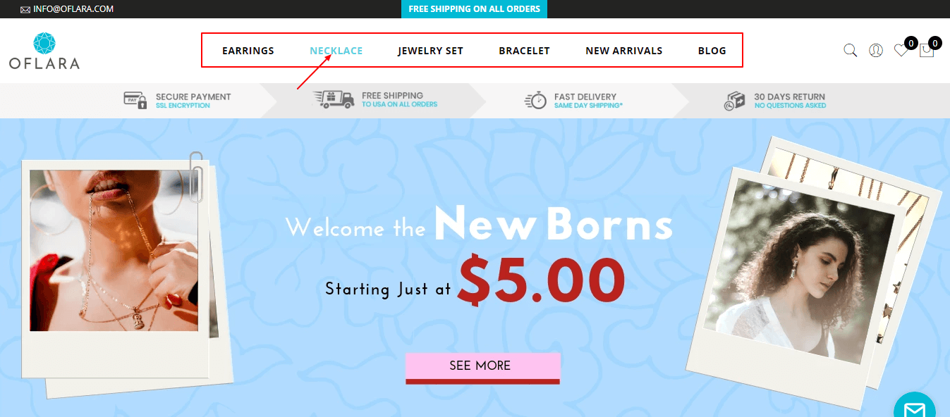 The original (click-based) menu, where the color of the category changes when the cursor hover over it.
Variation: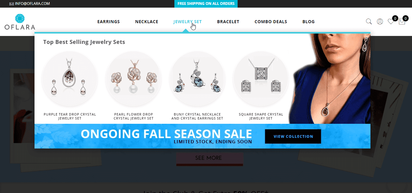 Variation 1 (Jewelry Sets) has a mega menu drop, featuring a few selected products.
Result: After running this experiment for about a week, we concluded the variation increased direct visits and clicks, and it increased revenue by 53%.
This broke our misconception that mega menus can only benefit websites with a huge number of related categories.
This case study was based on the need of the website to increase user interaction with the navigation menu. Different kinds of sites require different sorts of navigation menus. When optimizing, one can aim to overcome any kind of obstacle that prevents users from converting, decreasing bounce rates.
Some reasons to optimize navigation menus include:
- Increasing product findability
- Reducing bounce rates
- Having an eye-pleasing header and menu layout
- Improving traffic flow throughout the website
- Increasing user interaction with the menu bar
- Getting more clicks.
Examples of Good Navigation Menus Based on Different Criteria
Navigation menus can be optimized on the basis of the nature of the website, user behavior, the number of products, and conversion goals. This leads to the ideas, which are turned into hypotheses, which then can be tested via A/B testing.
Here are a few reasons to improve your website’s menu with A/B testing, along with a few real-world examples of each.
1. To Increase the Visibility of Each Item
Segmenting a huge number of items so that each item gets equal exposure based on the user’s interest is a task that should be done precisely, but there are many design solutions to display this type of website situation in a navigation menu. Since users explore your website via the navigation menu, the parent categories should be placed accordingly. This not only makes the navigation menu look cleaner but also increases the visibility of each category (as compared to a long drop-down).
Example #1: Using subcategories per the number of products.
An audience-oriented navigation menu is required to maximize the number of potential users from daily traffic. E-business is all about making an easy purchase or having a service one click away. If users don’t find your navigation menu easy to understand, they’ll leave the site immediately.
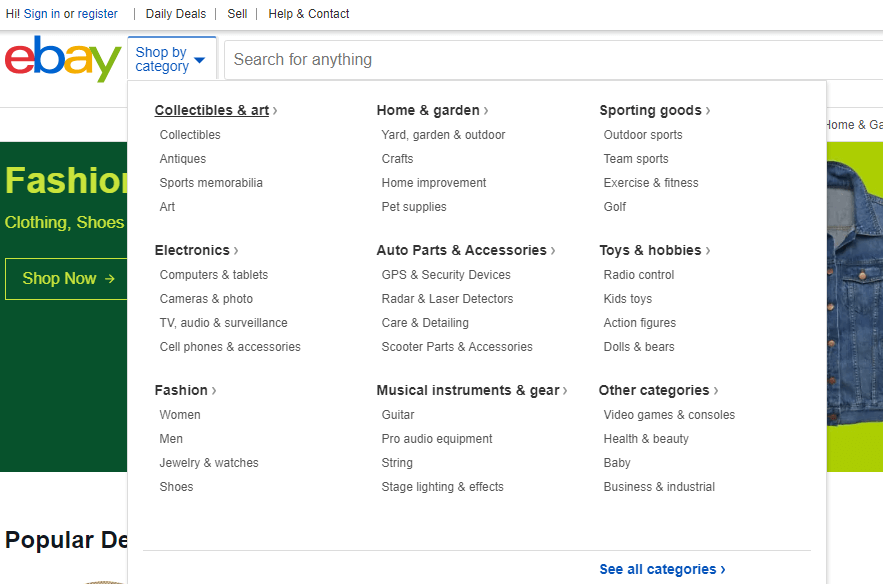
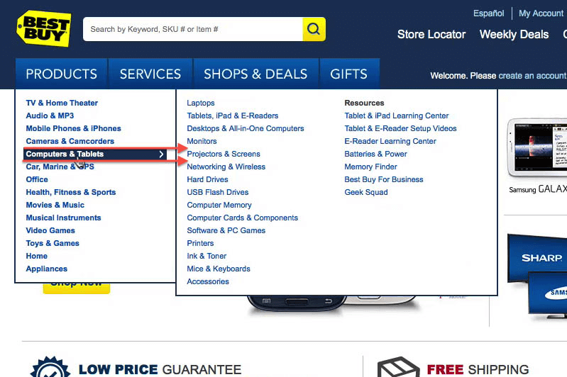
Ebay is a successful e-commerce business with an immense amount of products to offer. Categorization such as this is easy to interpret and understand, which is what a navigation menu should aim to achieve.
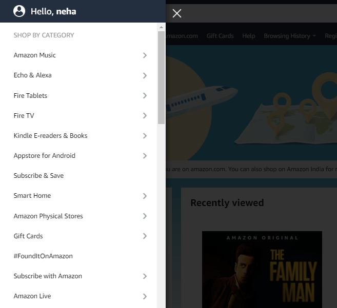
For websites or businesses which have many categories, try to segment them by using sub-categories. These are good for decluttering a messy menu with too many options to choose from. By segmenting, you give the user a choice to click on the one they need without any other optional distractions. Another universal example of a website using a nicely categorized mega menu is Amazon. They have a huge variety of products, which they present in a very systematic manner under various categories.
By having eight options to choose from instead of 30, you help users in evaluating the options and make the decision-making process quicker. But since your audience range is now high, and you don’t want to lose any user who comes for a particular product, it becomes hard to choose which categories to display at the forefront of the navigation menu.
This is why you should A/B test navigation menu bar before segmenting your mega menu into a cleaner version: so you can know what to place where and what impact each change has on user experience and behavior.
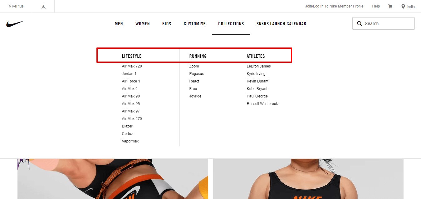
Example #2: Highlighting different sections in two menus.
Since Microsoft has many categories to offer, they’ve distinguished them into two separate bars. One highlights the main items in one bar. On the other side, all remaining items are placed under All Microsoft using a mega menu segmented with subcategories.
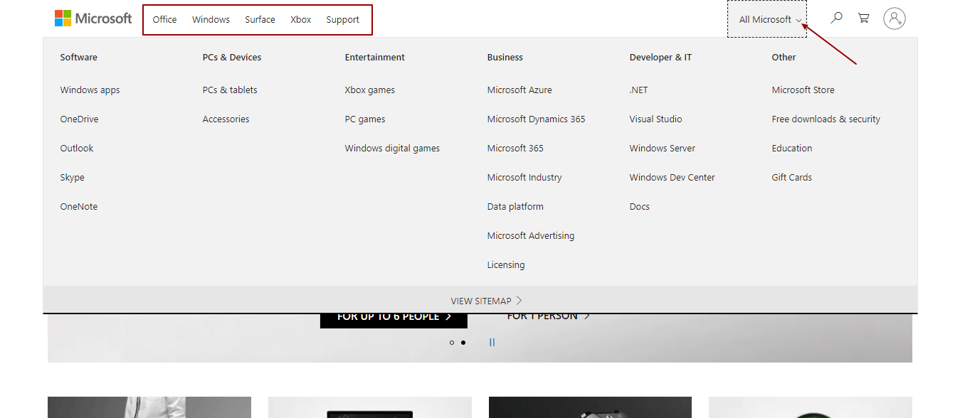
This example can be considered a base for experiments in which the business wants the website to highlight main products separately within a header.
Another example is UNICEF, which is a non-e-commerce website. They still use the same approach to promote their causes separately in a horizontal bar and place all other options in a drop-down menu under Explore UNICEF.
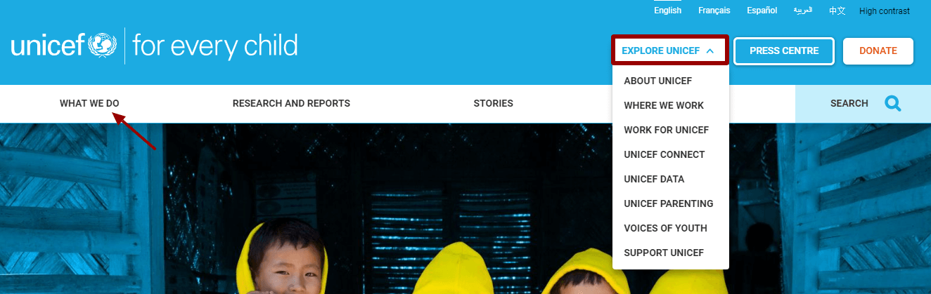
This helps them highlight the organization’s main cause from the course of actions a user can make further while exploring more.
2. To Increase User Interaction and Engagement
Referencing the case study we featured above, the goal was to have a visually interactive navigation menu despite having fewer items to showcase. But that does not mean the menu with more items could not use visually appealing animations, images, or other figures to make the menu more interesting in general.
Boring designs can result in low user interactions with the menu bar, and there are so many design solutions that could optimize plain navigation. A customized navigation menu could be implemented with the help of A/B testing since coding is used for the experiments. This will also help you figure out users’ interactions with the new design.
Example: Stand out through visually engaging designs.
The task while making the menu bar interesting is to keep it minimalistic enough to not confuse or distract the user completely. Top-level navigation plays an important role in decision making for a conversion to happen.
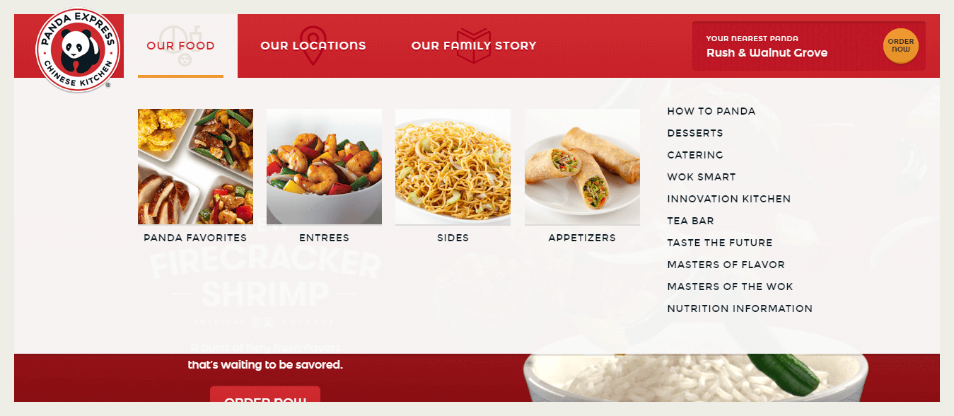
Images attract users more than words because users can identify the desired items more quickly. But it’s also easier to have animations in a menu with fewer items than for websites with many items.
In the following image, Panda Express features images in the menu to make it more visually pleasing:
The same could also be done for sites with plenty of items to offer by using animations as buttons for main products in the menu, which can then be used to open the list of subcategories. There are so many design solutions to this approach to increase interaction, if implemented effectively.
3. To Increase Usability
Some of the most important features of navigation include being accessible, useful, and easy to interpret. The navigation design solution should be optimized to provide maximum usability to the user and help them easily navigate from the landing page to other desired options. There are so many designs to choose from, and the possibilities are endless when customized. The solution should be based on user behavior analysis, the site’s type, the number of items, etc.
To help you start brainstorming about optimization, here are a few more examples from websites that use the most appropriate user-oriented navigation menus.
Sidebars 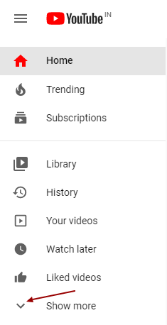
Horizontal Drop-Down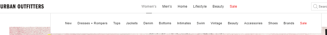
Vertical Drop-Down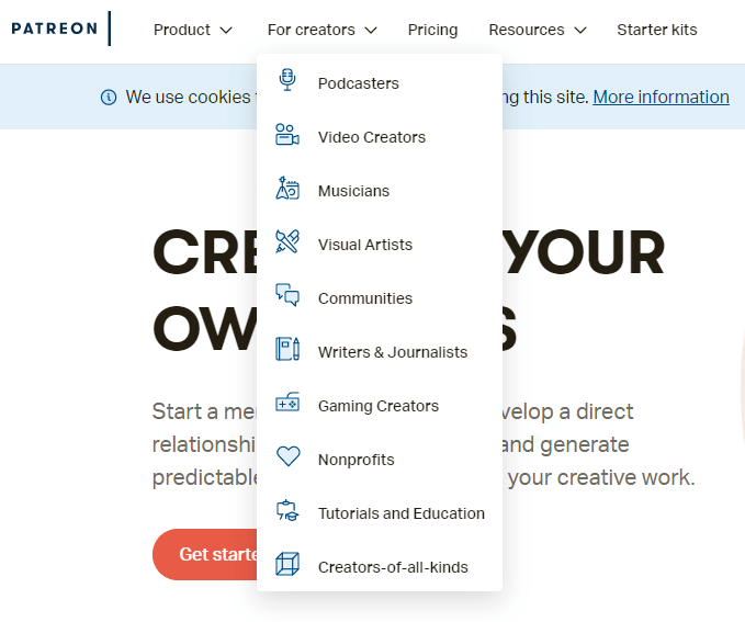
Mega Menu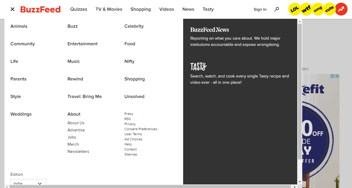
Troubleshooting a Common Problem Caused by Poor Navigation Menus
A common issue with poor navigation menu function is the “double-hover interaction.” Websites with a large number of items in their navigation menus use layering to segment items by subcategories, which if placed closely could result in double-hover interaction issues. This often leads to bad performance of the navigation menu’s usability and prevents a smooth transition to the desired page due to falsified clicks.
To explain it further, let’s use the following example.
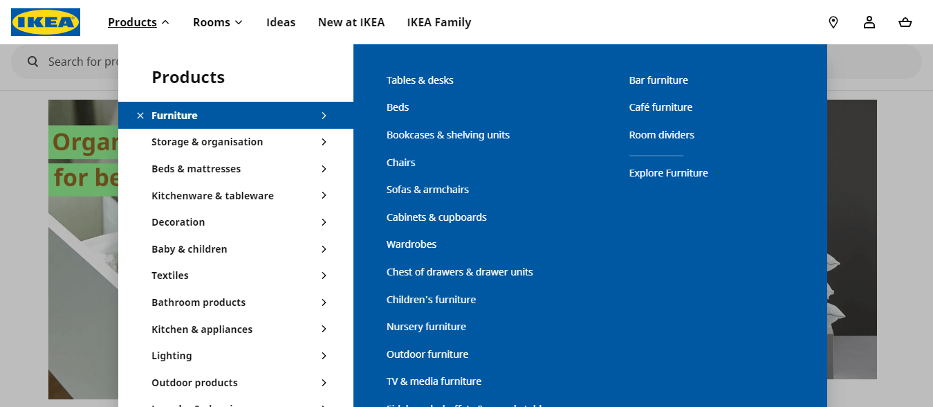
In the image below, the steps for a user to navigate to the desired page are to first click or hover on the Products option, which opens a drop-down menu with main categories.
 Source: Baymard
After the user hovers on the category, another drop-down menu opens up, which also uses hover. When the user activates the second hover by moving the cursor toward the subcategories, it becomes difficult to manage between the closely placed menus, causing the double-hover interaction.
Eventually, double hover results in:
- Accidently clicking or hovering on an unintended item
- Closing the menu altogether due to friction of transition caused by double hovers.
Solution #1
There could be many solutions to this problem based on the developer’s design process. To begin eliminating this issue, you need to explore that design. This is why A/B testing the navigation menu’s performance is necessary before permanently implementing changes — so these issues can be solved during the testing process, to prevent them from impacting conversions.
The first possible solution is to have the main navigation bar consist of main products instead of having them on a drop-down.
Solution #2
The other solution is to have a drop-down with clicks instead of hover, which will eliminate the entire hover issue altogether.
This may not be applicable to some navigation menu designs that come with the theme of your entire website along with its template. However, you can have it custom designed with the help of HTML and JavaScript coding by A/B testing developers. That way, it can be tested beforehand and be removed if it causes any havoc to the performance of your website.
This is just one example of how the navigation menu can affect conversions and manipulate the user experience. There are plenty of other issues possible, such as flickering of drop-downs, faulty designs, not being able to customize the navigation menu, or bad choice of display products on the menu bars. That’s why you should explore any possible thing wrong with your navigation menu and fix them with the help of A/B testing — to know which optimization improves your site the best.
How to Run a Navigation menu A/B Test With Brillmark’s Help
We curated this article to throw some light on an important element: navigation menus. And at the beginning of the article, we explained the importance of ab test development for optimization of your site’s navigation menu. Now that you are aware of the criteria and examples which could also be used as a starting point, you can start brainstorming regarding the navigation menu changes for your very own website.
The ideas in this article are based on our experience developing navigation menu A/B tests for our clients. The major issue many of them face before coming to us is that most websites are designed on theme templates, which come with a specific set of options for the navigation menu and other elements. This prevents them from having the desired optimization in that specific portion.
As fixing it will require their team to manually code the whole navigation menu, this hinders the A/B testing process also.
To simplify this, our team of A/B testing developers not only builds the experiments but also customizes the design per the client’s needs and ideas. Our experience helps us do that on every A/B testing tool, website hosting platform, device, and integration.
Here is the process of managing navigation (or any other A/B testing) with Brillmark:
- Pick a Hypothesis
Once you identify the problem areas on your website, you can come up with an improvement strategy. With the help of a CRO team or your in-house team of marketers, you can ping us to come to your experimenting rescue! You just need to explain your idea and the reason behind the suggested version to help us understand your vision.
- Provide Your Testing Requirements
This could include anything, including related links, access to the required tools, or traffic allocation. We’ll discuss the task with our team and send you a quote for hours needed to complete it, along with the technical specifications.
- We Create The Technical Design
Then we create a mockup version of the design for you to approve before we begin working on it. Once approved, we start building the variation.
- Development and QA
Then comes the whole development process, which can vary depending on the platforms or tools required. Development of the technical design and framing of the experiment is done with the help of our team of skilled developers and UX designers. Before implementing the test on the site, we’ll run a deep quality assessment, so the experiment can be error free and run as it’s supposed to.
- Deployment
At last, after all the green lights, we’ll successfully deliver the experiment. Once it goes live on your site, we’ll lightly monitor it to confirm it is running smoothly without the presence of any unexpected issues.
Conclusion
Brillmark would love to help you explore your vision toward the endless possibilities of optimization on your website. To start with the first step, ping us to make things official.