



Cart abandonment is one of the biggest revenue leaks for online retailers. Even minor adjustments to your shopping cart and checkout flow can yield significant improvements in your conversion rate.
To help you systematically optimize your store, this guide breaks down 25 actionable A/B test ideas categorized by psychology, user experience, trust, and checkout speed.
- Check out ecommerce cart A/B testing ideas
Core Cart Optimization Strategies
Instant Slide-In Cart: Program the drawer to slide out automatically from the right or left edge the moment a user clicks “Add to Cart”. This visual feedback confirms the action without interrupting the shopping flow.
Inline Modifications: Allow shoppers to adjust quantities, select product variations (size/color), or delete items directly inside the sidecart panel. Every change should update the price subtotal dynamically via AJAX without a full page refresh.
| Optimization Pillar | Key Focus Area | Target Metric |
| Trust & Transparency | Upfront pricing, microcopy, payment logos | Cart-to-Checkout Rate |
| User Experience (UX) | Editing ease, mobile responsiveness, layout | Friction Reduction |
| Speed & Flexibility | Express wallets, guest checkout, local currency | Checkout Completion Rate |
| Urgency & Incentives | Free shipping thresholds, low-stock alerts | Average Order Value (AOV) |
Part 1: Building Trust, Transparency & Reassurance in Cart Page
Building trust, transparency, and reassurance on the cart page requires eliminating financial surprises.
Guaranteeing transaction security, and providing immediate access to customer support. Shoppers hesitate when they feel uncertain. These tests focus on eliminating doubt and building immediate confidence.
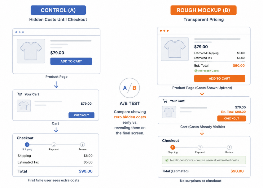
1. How do you prevent unexpected costs in the cart?
- Display estimated taxes
- Shipping fees & extra charges upfront.
A/B Test Idea: Compare showing zero hidden costs early vs. revealing them on the final screen.
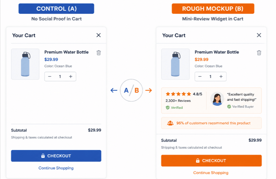
2. Does social proof inside the side cart increase conversions?
- Embed star ratings & reviews, or customer testimonials directly inside the cart drawer or page.
A/B Test Idea: Test adding a mini-review widget next to high-intent cart items.
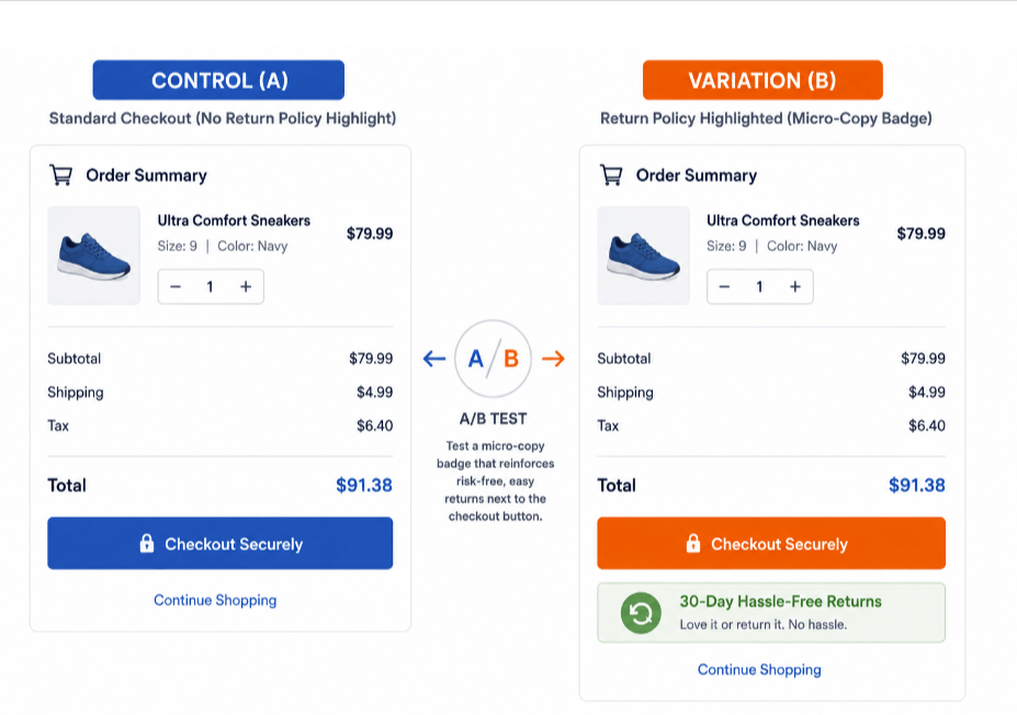
3. Where should you place your return policy in the cart?
- Reinforce risk-free, easy returns right next to the checkout button.
A/B Test Idea: Use a microcopy badge stating “30-Day Hassle-Free Returns.”
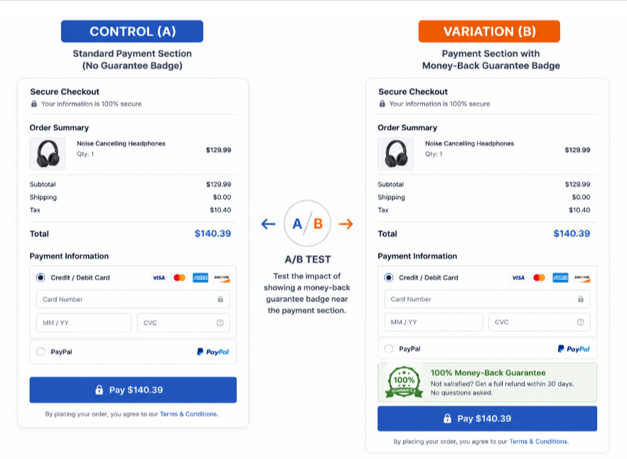
4. Does a money-back guarantee reduce checkout friction?
- Reduce purchase anxiety with a clear satisfaction guarantee icon.
A/B Test Idea: Display a “100% Money-Back Guarantee” badge near the payment section.
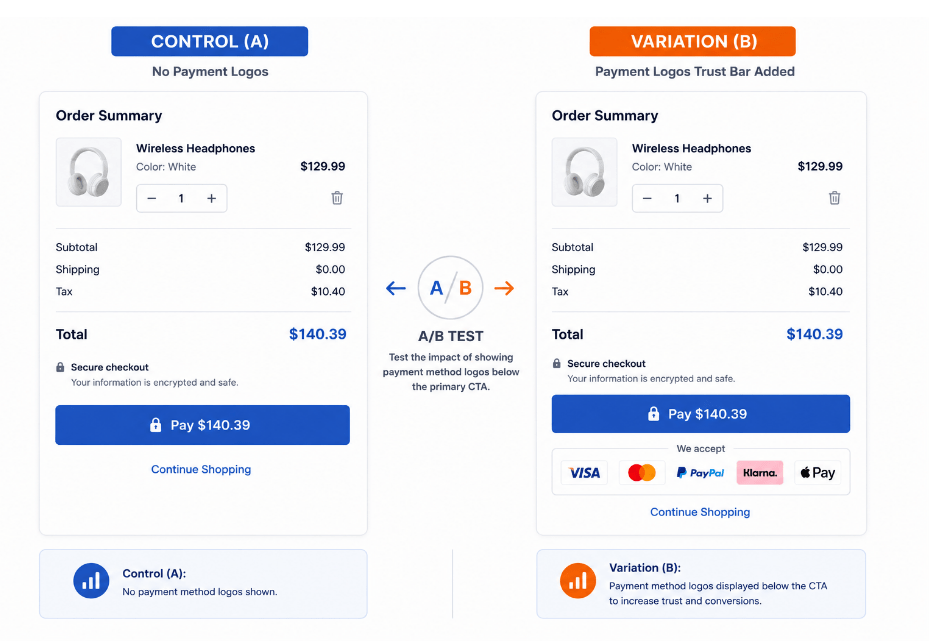
5. Which payment method logos build the most trust?
- Show recognizable logos (Visa, Mastercard, PayPal, Klarna, Apple Pay) to signal security.
A/B Test Idea: Add a trust bar showcasing accepted payment providers below the primary CTA.
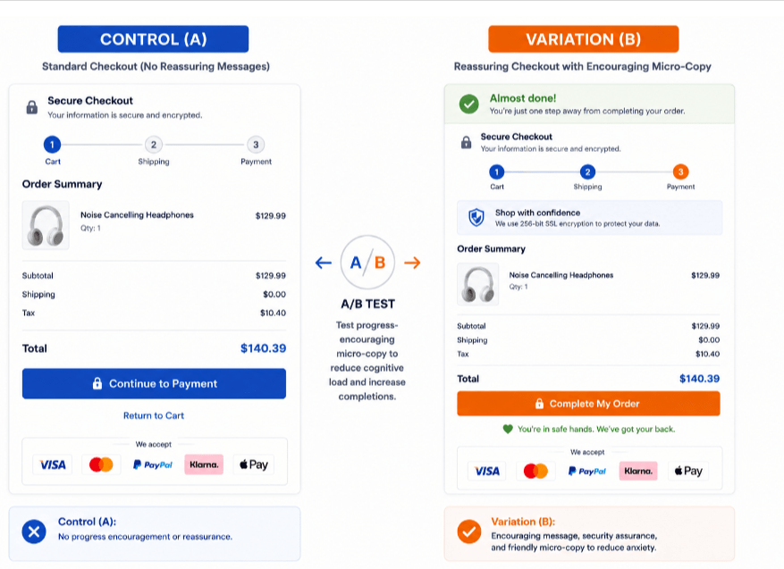
6. How does microcopy in the side cart impact drop-off?
- Add comforting microcopy like “Almost done!” or security assurances.
A/B Test: Test progress-encouraging prompts to lower cognitive load.
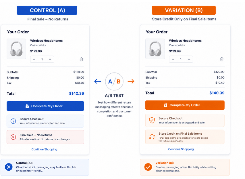
7. How should you frame return policies on sale items?
- Replace rigid rules with reassuring, customer-friendly return messaging.
A/B Test Idea: Compare “Final Sale – No Returns” vs. “Store Credit Only on Final Sale Items” to find the sweet spot between risk and clarity.
Part 2: Enhancing User Experience & Reducing Friction Sidecart
A sidecart (also known as a cart drawer or slide-out cart) enhances user experience and reduces friction by eliminating the need for page-to-page transitions. Instead of redirecting users to a standalone cart page every time they add a product which is the single biggest friction point in e-commerce, a sidecart immediately slides into view. This allows customers to view items, modify quantities, and apply discount codes without losing their place on the product browsing page
A frustrating cart layout drives users away. These tests focus on making the cart intuitive and effortless to manage.
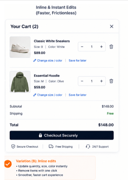
8. What is the best way to let customers edit cart items?
- Simplify quantity updates, item removals, and variant changes without page reloads.
A/B Test Idea: Compare inline dropdown quantity selectors against modal-based popups.
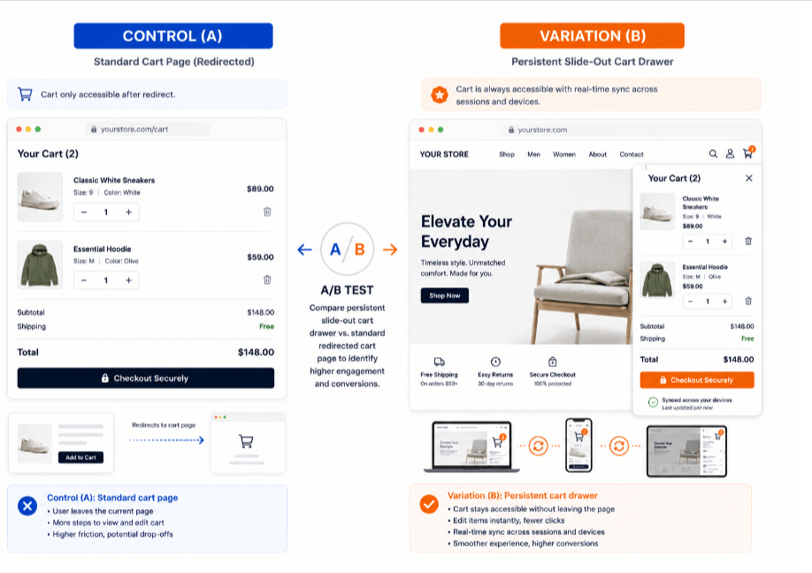
9. Should you use a persistent cart drawer or a cart page?
- Keep the cart accessible and synchronized across sessions and devices.
A/B Test Idea: Test a persistent slide-out cart drawer vs. a standard redirected cart page.
10. How detailed should product summaries be in the cart?
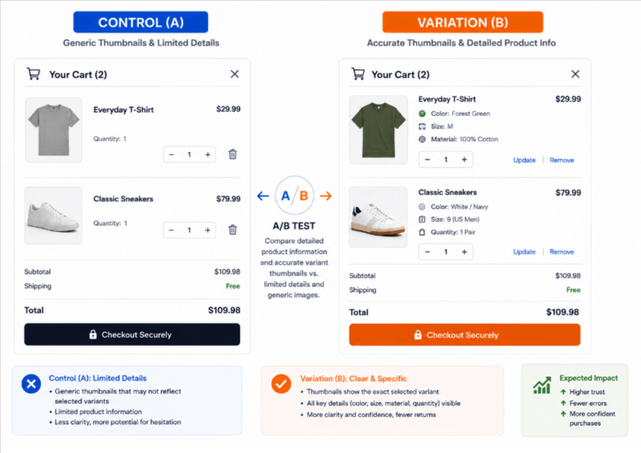
- Clearly display chosen variants, quantities, colors, and sizes.
A/B Test Idea: Ensure thumbnail images dynamically reflect the exact color/variant selected.
11. How should promo code fields be displayed?
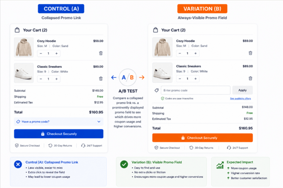
- Prevent promo code frustration and layout-breaking errors.
A/B Test Idea: Compare a collapsed/hidden promo link vs. an open, frictionless input field.
12. Should you remove navigation headers during checkout?
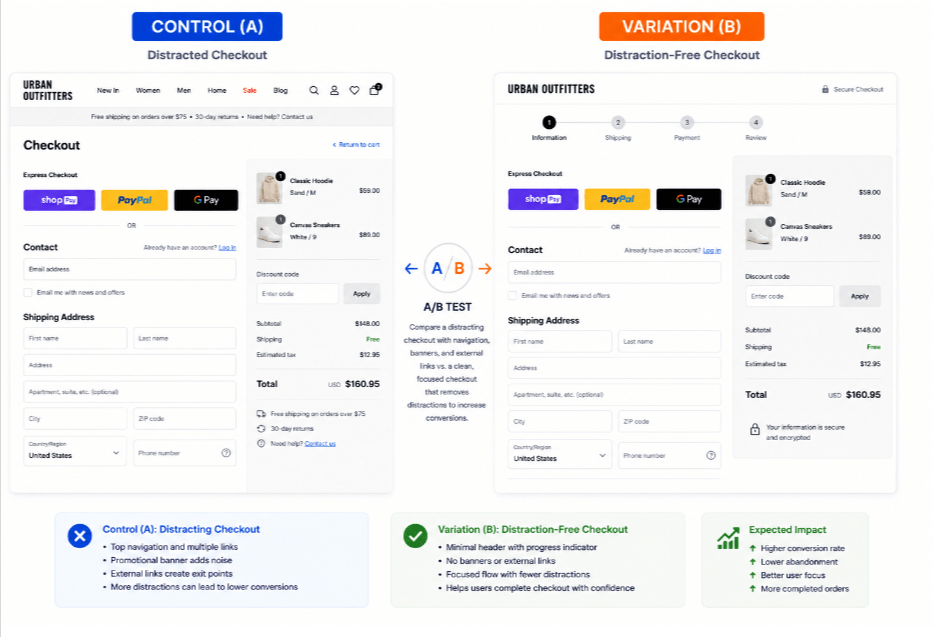
- Remove unnecessary top navigation, banners, or external links on the checkout page.
A/B Test Idea: Test a distraction-free, minimalist header in the checkout flow.
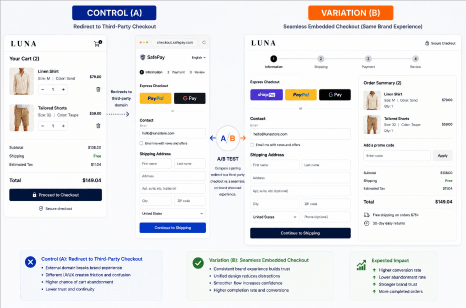
13. How does checkout UI consistency affect conversion rates?
- Keep a consistent UI and brand styling throughout the entire checkout journey.
A/B Test Idea: Compare a seamless embedded checkout vs. a jarring redirect to a third-party domain.
Part 3: Streamlining Speed & Checkout Flexibility in Side Cart
To streamline speed and checkout flexibility in a side cart (sliding drawer cart), you must optimize technical performance while removing friction from the purchasing pipeline. The faster a customer can finish buying, the higher your completion rate.
14. Do express checkout buttons increase mobile conversions?
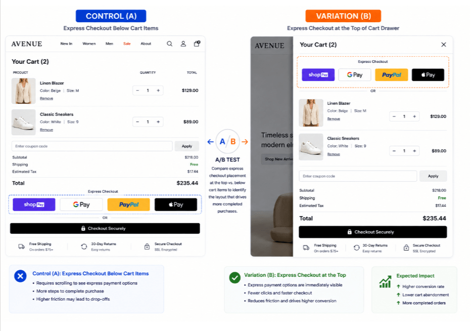
- Integrate one-click methods like Apple Pay, Google Pay, Shop Pay, and PayPal.
A/B Test Idea: Place express payment options at the very top of the cart drawer.
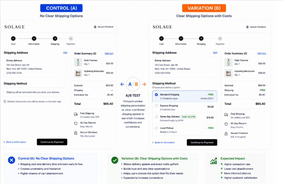
15. How should shipping options be displayed in the cart?
- Provide choices such as Standard, Express, Same-Day, or Local Pickup.
A/B Test Idea: Present a dropdown or radio list of shipping speeds clearly tied to delivery costs.
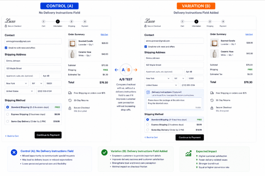
16. Does adding a delivery notes field hurt conversion?
- Allow customers to leave specific delivery notes (e.g., “leave at side door”).
A/B Test Idea: Measure if adding an optional delivery comment box increases perceived customer care without increasing drop-offs.
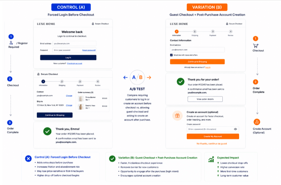
17. When should you prompt users to create an account?
- Delay account creation until the purchase is complete to reduce friction.
A/B Test Idea: Compare forced login before checkout vs. a guest checkout with a post-purchase account creation prompt.
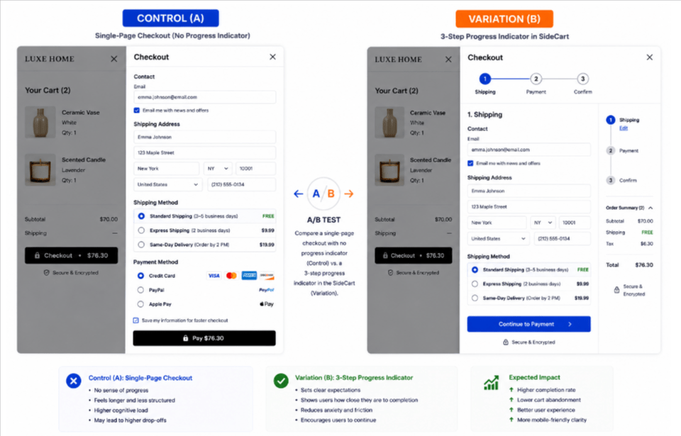
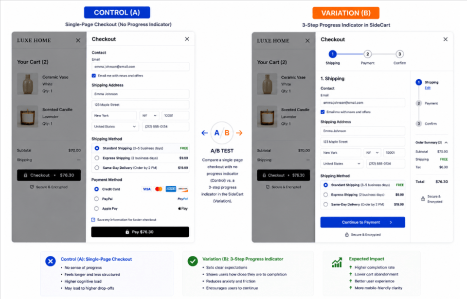
18. Do progress indicators improve multi-step checkouts?
- Implement a clear multi-step checkout progress bar.
A/B Test Idea: Test a 3-step numbered indicator (Shipping > Payment > Confirm) vs. a single-page layout.
19. Should pricing automatically adapt to local currency?
- Automatically localize pricing based on the visitor’s geographic location.
A/B Test Idea: Test automatic currency detection vs. letting users manually toggle currencies.
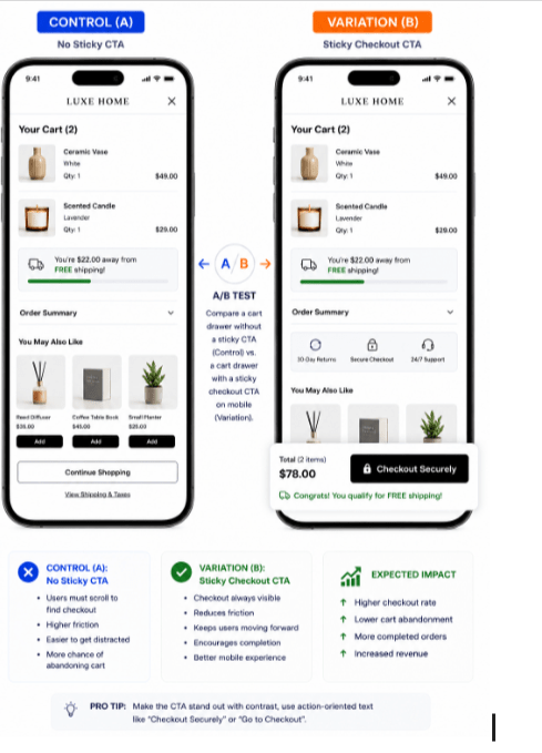
20. How do floating checkout CTAs perform on mobile?
- Use sticky CTAs or dynamic prompts to keep users moving forward.
A/B Test Idea: Implement a floating sticky checkout button on mobile devices.
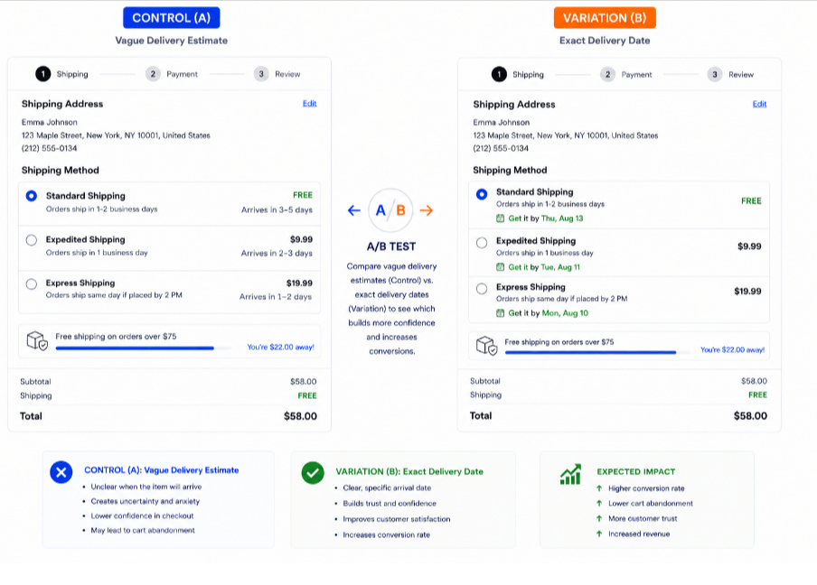
21. Do exact estimated delivery dates increase sales?
- Show the exact expected arrival date rather than vague transit days.
A/B Test Idea: Compare “Arrives in 3-5 days” vs. “Get it by Thursday, August 13.”
Part 4: Driving Urgency & Value Incentives in Cart
Driving urgency and value incentives in the shopping cart requires a balance between psychological triggers and friction-free user experience. The goal is to reduce cart abandonment by making the purchase feel both necessary right now and financially advantageous.
Motivate shoppers to cross the finish line right now rather than later.
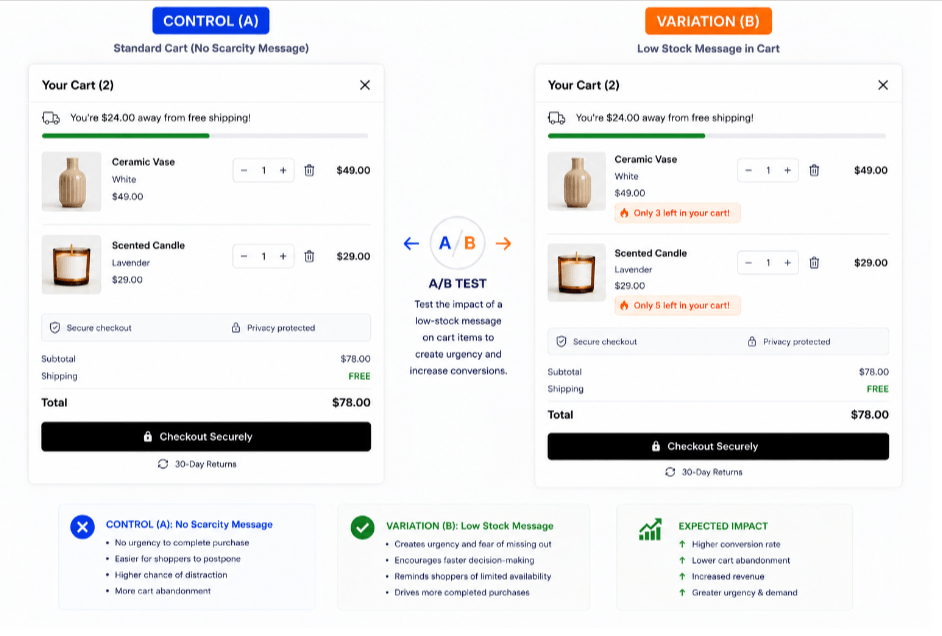
22. Do low-stock alerts in the cart trigger fast purchases?
- Show low stock warnings, limited-time inventory holds, or countdown timers.
A/B Test Idea: Test a subtle low-stock message (“Only 3 left in your cart!”) on high-demand items.
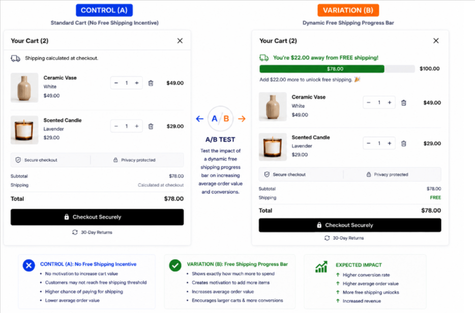
23. How do dynamic free shipping bars affect AOV?
- Encourage larger basket sizes with free shipping thresholds in cart.
A/B Test Idea: Add a dynamic progress bar tracking how much more the user needs to spend to unlock free shipping.
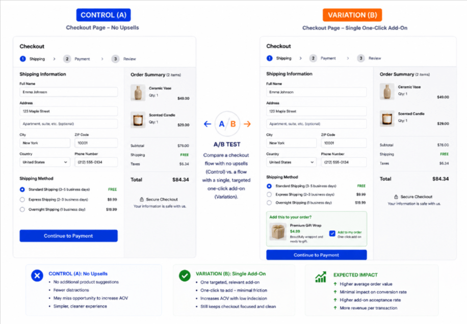
24. Should you upsell inside the checkout flow?
- Avoid overwhelming shoppers with excessive product recommendations during checkout.
A/B Test Idea: Compare a checkout page with zero upsells vs. a single targeted, one-click cart add-on.
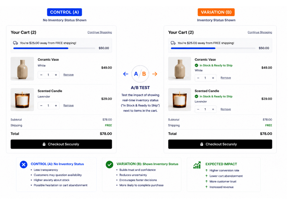
25. Should real-time inventory status be explicitly shown in cart?
- Display real-time inventory status clearly in the cart summary.
A/B Test Idea: Test indicating “In Stock & Ready to Ship” next to item names.
Pro-Tip for A/B Testing: Always run your tests long enough to reach statistical significance, and prioritize testing changes on mobile devices first, as mobile traffic typically accounts for the majority of e-commerce browsing sessions.
What is the average e-commerce cart abandonment rate? The industry average cart abandonment rate across e-commerce is approximately 68% to 75%, with mobile devices experiencing higher rates (~80%) compared to desktop.
Which cart A/B test should you run first? Prioritize testing Express Checkout Options (Apple Pay/Shop Pay) and Upfront Shipping Costs. These resolve the top two reasons for abandonment: form friction and unexpected fees.
Where to start while A/B Testing Shopping Cart
If you are deciding where to start, prioritize Express Checkout Options and Transparent Pricing first. These two areas consistently deliver the highest return on investment because they target the top two drivers of cart abandonment: sudden unexpected costs and tedious checkout form friction.
Here is a quick framework to choose your immediate priority based on your current analytics:
- High Drop-Off at the Shipping/Payment Step: Start with Trust Signals & Price Transparency. If users leave once extra fees appear, test showing estimated taxes, dynamic shipping thresholds, and clear payment logos right inside the side cart drawer before they click checkout.
- High Drop-Off on Mobile Devices: Start with Express Checkout & Speed. Mobile users hate typing long credit card details. Testing one-click options like Shop Pay, Apple Pay, or PayPal at the top of the side cart eliminates form fatigue instantly.
- Low Average Order Value (AOV): Start with Value Incentives. Testing a dynamic Free Shipping Progress Bar in the cart actively encourages users to add one more item to hit the threshold rather than abandoning the purchase.
If you aren’t sure where your biggest friction point is, auditing your desktop vs. mobile completion rates will immediately point you to whether speed or trust is your primary leak.
Which specific area of your current checkout funnel (e.g., trust signals, shipping options, or express checkouts) are you looking to optimize first?