

Mobile navigation menus are a tough nut to crack when it comes to optimization, especially since the improved version should be smaller yet visible and accessible at the same time. A horizontal strip, three dots in the corner, a sidebar, a different page for a gigantic menu, etc. — there are more than enough types of menus to choose from. The options are endless, and so are the designs. The type of site, the products, the number of visitors, and many more aspects could all influence design decisions.
In short, different kinds of websites use the most effective solutions they can to get the most conversions through navigation menus. And A/B testing helps find which one performs best at providing user satisfaction. Implement your mobile menu with the help of A/B test experiments, which work as a bridge to connect your ideas to performance — and results.
That’s why we place an emphasis on considering user behavior toward the mobile navigation menu before moving forward with new designs. There are no set patterns and rules for successful mobile conversions, which is why experimenting is so important: to find the best user-interaction-generating menu for every website.
In this article, we feature a few design solutions to common mobile navigation problems, solved with the help of mobile navigation best practices experiments.
Navigation Menu Problems: 4 Examples and Solutions
1. Large Menus
Having a navigation menu that looks like a directory is no good for showcasing the products and services of your website in the simplest way ever. A user will likely find some other website which makes that option more easily accessible. It becomes particularly challenging on mobile devices, where the area is already very compact and the design has to be very small.
Why This Is a Problem: Besides shopping elsewhere, choice overload on your site could put consumers off to the extent that they end up not making any choice at all. This works as a friction point and may prevent the user from moving forward to other pages of your website.
Solution
Many huge e-commerce websites that do require massive menus follow many effective approaches, including using multiple subcategories under the main categories, which then lead to the list of options to choose from. This can be done with the help of a sidebar or a separate menu page with a wider area to be creative with.
Example: A sidebar menu vs. a separate menu page:
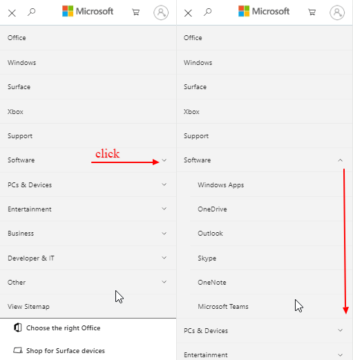 Microsoft uses a sidebar with subcategories.
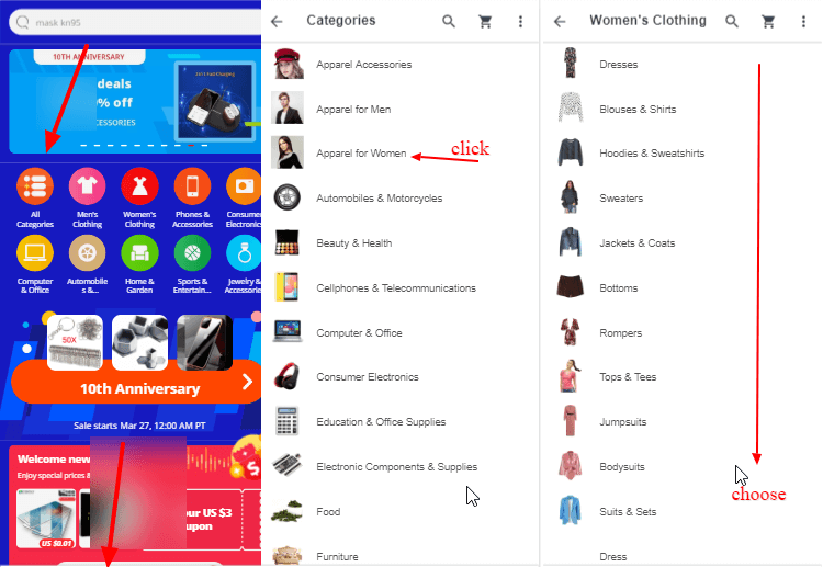 AliExpress uses a separate page featuring items under the main category.
These are just two examples that showcase a huge menu, but there are many more design solutions for this. Deciding which one to select could be a guessing game. That’s why we advise you do these types of overhaul optimizations with the help of A/B testing.
For example, the options above could become variations to your original menu, and the one that performs best in the experiment could be implemented permanently.
2. Less Interactions and More Exits in Mobile Menus
Despite having very clean and simple menus, some websites do not see expected user interactions with the navigation menu when analyzed.
In screen recording tools such as Hotjar, you may find clicks on the menu but no clicks on the options displayed further within it. This could imply the mobile menu has high exit rates. There could be many reasons behind this, including your consumers finding other, more aesthetically pleasing mobile menus on other sites. But having an interactive and attractive mobile menu takes a little more effort, as there is less space to get creative with.
Why this is a problem: No or fewer interactions and higher exit rates on your responsive mobile menu leads to an increased bounce rate. This could mean the user doesn’t find it useful enough, or maybe a large number of visitors don’t fall into your niche. To prevent lost opportunities, lure them into exploring more with attractive visuals and creative elements.
Solution
Either way, you want to use all traffic to your benefit. A website needs to engage every user with the navigation menu by making it interesting enough for them to move forward. You may want to use icons, images, slang, creative headlines, colors, fonts, or sizes, depending upon what works the best for you.
Example 1: Use of icons in the menu tab:
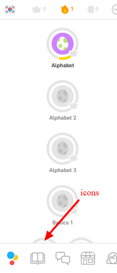 Duolingo uses icons in the navigation menu tab.
Example 2: Featuring images on a separate page to reveal the other options:
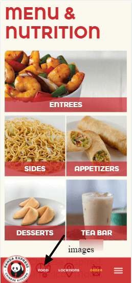 Panda express uses images to display options
Since there are endless options to choose from, you can pick the most suitable ones with the help of A/B testing. This will help find the one that engages users most and therefore contributes to increased conversion rates.
3. Menu Is Not Instantly Visible (Hamburger Menus)
One of the most popular menus used on mobile devices is the hamburger menu. These are often used for a clean and minimalistic look, which helps sites that can’t contain all of their products and options in the tab bar. But many websites that use it are doing so just because “most” websites do — and they fail to explore the drawbacks of choosing that kind of menu. They are not easily, instantly visible and often fail to perform functions for the user to make them understand:
- Where they are
- Where they can go
- What they can do.
All these things should be conveyed by the menu at the very first glance.
According to Baynard Institute’s mobile site navigation research, “42% of mobile e-commerce sites do not have a homepage design that enables users to accurately infer the type of site they’ve landed on.”
Why this is a problem: When the menu bar is not visible without clicking, the whole process of navigation gets stretched. Now things are not one but two or more clicks away. This decreases the discoverability of the mobile menu.
Solution
Among many design solutions that work well in combination with the hamburger menu, you can also have a link bar, or a tab bar that includes priority actions, or navigation blocks to engage users more. Hamburger menu A/B testing is a great way to know if it’s the best option for your website or not.
Example: Spotify
 Source: Wikipedia
While improving the interface for their app, Spotify replaced their hamburger sidebar with a bottom navigation tab, which can be seen above. This action was taken after user testing to see how this would impact engagement. It found that users with the tab bar ended up clicking 9% more in general and 30% more on actual menu items.
4. Having a Small Space to Showcase a Mobile Menu Bar
Mobile navigation is hard to be creative with since resolution is very small. Everything has to be small enough to fit but still big enough to be visible. Consider A/B testing the menu bar before squeezing everything into that small header, to know your users’ response to it.
Why this is a problem: Sacrificing a few products or services from the main menu and moving them to some secondary navigation (such as a footer) is not always the best solution. This can lead up to many failed conversions from users who gave up before scrolling all the way to the footer.
Solution
There are plenty of design solutions to this issue, such as minimizing the font size, general design, horizontal scrolling, using navigation blocks, separate menu pages, dropdowns, etc. While some sites’ hamburger menus could be bad, they work best for sites with plenty of products but not much space.
Example: A horizontal scrolling navigation link bar by Quora:
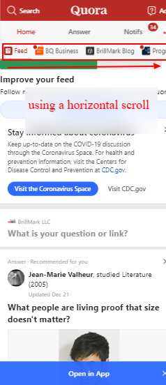 Horizontal Scroll
Best Practices for Optimizing Mobile Navigation
1. Navigation Patterns
Based on the above problems, you may be able to just choose the menu design that resolves them. But if you haven’t explored navigation problems yet and want to experiment with a new navigation menu for mobile, you may need to know more about navigation patterns for mobile. These include bottom navigation tabs, hamburger menus, sidebars, floating menus, priority sections, and many more options. Choose the winner after a good navigation menu testing session designed specifically around mobile users.
2. iOS vs. Android
There are some apps which are only available in iOS, only available in Android, or available for both. As operating systems vary, this can sometimes interfere with design symmetry. That’s why companies like to experiment with different designs based on each operating system. Test the options before making any permanent changes to displays for either one. Here’s an example of Facebook on three different platforms:
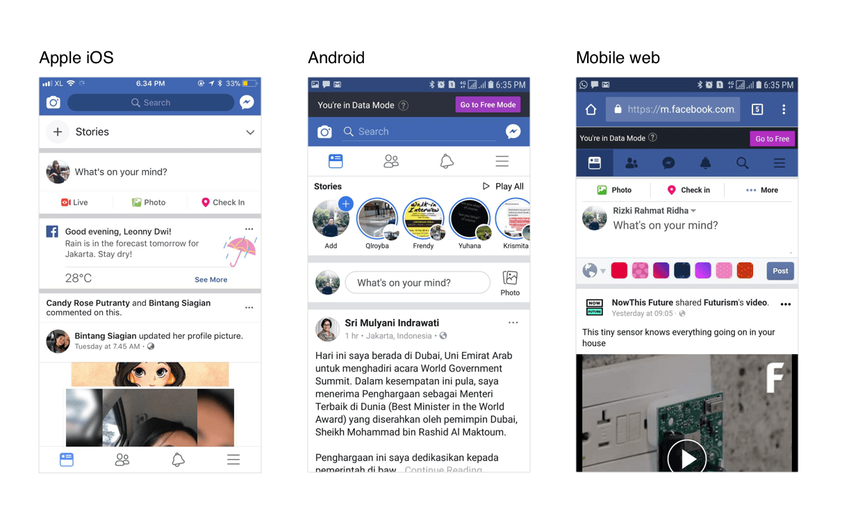 Source: muz.li
3. Mobile Sites vs. Apps
The optimal design for one site can vary between the mobile site and an app, but the best way to know is by testing the navigation to collect information about users’ preferences. Here’s another example from Facebook’s mobile site and its app:
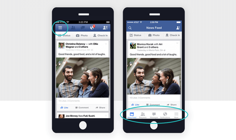 Source: justinmind
Because user experience can differ so much between the two types of platforms, check which one works best for users with A/B testing.
4. Navigation Placement
With plenty of navigation patterns available, it’s better to use whichever one is likely to work for the biggest number of users. It’s also always arguable whether mobile navigation belongs at the bottom or the top.
We suggest using screen recordings and heatmaps for boosting the A/B testing process to understand your users better. You can also create two or more variations to know which garners more engagement.
5. Other Important Elements of Navigation Menus
Based on user testing for mobile devices, you should be able to see which combination of elements works best for your website to generate the most conversions and revenue. These elements could include:
- Font
- Color
- Icons
- Images
- Size
- Design
- Functionality.
The list goes on, but these are a few starting points to remember before moving forward with design ideas via A/B test experiments.
Align Navigation Design With User Goals
It’s also helpful to figure out user personas before moving forward with changes on any important elements of mobile sites. The usability of the site will depend on providing the best user experience to users, so you’ll want to align your navigation menu design (or any element design) with user goals in mind. If users find it difficult to move forward from the menu, there might be something missing in it, which needs to be resolved quickly.
The navigation menu should help users move within the site easily — it could determine users’ initial thoughts about and actions on your site:
- What does this site have?
- What product do I want?
- Where should I click to open the menu?
- Which icon looks like the menu?
- Where is the “back” button?
- Why is this button so small?
You can create your own hypothetical user scenarios to help you figure out the design and eventually resolve actual user concerns by delivering an improved navigation menu. If you don’t test your new design, you may never know if it’s working the way it was meant to or not.
Experimenting and split-testing mobile menus not only validates assumptions but also helps you analyze user interactions with your menu.
Two very different mobile navigation designs to showcase the same type of products could look like best candidates for you to consider as a new design for your website’s mobile navigation menu A/B testing.
Let’s look at an example.
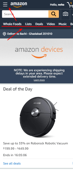
Example: Link Bar (Amazon) or No Link Bar (Walmart)
The link bar is a horizontal menu strip used to display the main products or service a website offers. Here’s an example from BBC’s mobile site, with a dropdown mega menu in the linkbar:
There are many things that could be done to a link bar to maximize its ability to increase conversions. In the following example from Amazon’s mobile site, they use a hamburger menu (three parallel lines in the corner) as well as a link bar to categorize their services:
On the other hand, Walmart’s mobile site does not have a link bar on its homepage, but they do use a hamburger menu:
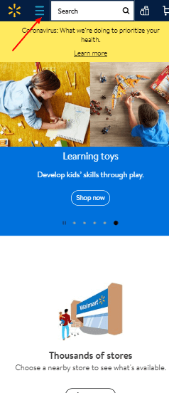
If compared, Amazon and Walmart are different in terms of variety, but both are leading eCommerce websites. Despite the similarities, they each have a different approach to navigation menus.
But instead of making assumptions, it’s better to make both designs compete in an A/B experiment for mobile navigation. The one that performs better can then be used as a long-term solution, since it has proven to be the ideal menu for your mobile site.
A/B Testing Your Navigation Menu With Brillmark
Here’s a rough idea of what it’s like to have Brillmark develop and run your mobile-friendly navigation split test experiments for you.
1. Idea Generation
An audit should be done either by your marketing team or CRO agency to identify problem areas and areas which can be improved by optimization. In this case, a mobile navigation menu is that area. Ideas should be collected to know what variations are needed, then document any known technical requirements.
2. Technical Aspects
You send us the technical parameters for the test, goals, etc. We send you an estimate for the hours we’ll need to set a deadline and estimated quote. Once you’ve approved that, the hypothesis and wireframing begins.
3. Development
Our development team takes charge, and we’ll call in designers and additional experts if required. We then develop the test locally on the tools of your choice. Our quality assurance team reviews the test to ensure it’s free of any bugs or errors, then they forward it to you for approval.
4. Implementation and Running
Once the test is approved, we implement it on live site and launch it on the live site. We’ll also monitor it to keep a check on the test’s performance, to make sure it’s working like it’s supposed to.
5. Repeat
You can then move forward with the next test, and the whole process is repeated step by step for each test after that.
Ping Brillmark to get us on board, and let’s start experimenting.