Online shops are no stranger to abandoned checkout problems, as there’s always a gap between the number of visitors who land on your e-commerce website and the visitors who hit the Checkout button.
A little gap is natural, but it becomes serious when that gap increases. If so, there might be some loophole in the cart-to-checkout journey that’s pulling all those potential customers away from making a purchase. That needs to be fixed as quickly as possible, since you can’t afford to lose that revenue.
The same could be said for websites that sell digital products. They may or may not have carts, but they do have a checkout process that happens often.
To increase your conversion rate, checkout page optimization may be necessary. Optimization can be done with checkout page A/B testing, which is where we at Brillmark come in. We build and run A/B tests to illuminate the design solutions you need to have implemented on your checkout page.
Why A/B Testing Is Necessary for Checkout Optimization
This kind of optimization testing helps validate all the changes you make so you know for sure they work. All the KPIs, clicks, conversions, and more are recorded in the experiment results. That’s how an effective checkout page should come into existence: You get to know if your audience likes it or not by comparing a new version to the existing page (control version). Excellent user experience is the goal here, and increased ROI is the by-product of that.
The checkout process does not consist of only one click. It contains a few steps that help the user reach that final Thank You page. But before attempting to get more visitors through that process, we need to understand why visitors leave the online shop without any purchase — also known as cart abandonment.
Cart Abandonment
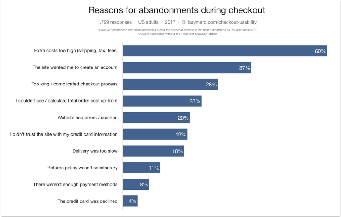 Source: Baymard Institute
The majority of digital product sellers do not have a cart. But many visitors who sign up end up not buying the product or the service.
For example, a user might sign up for a Netflix trial but be unable to buy the subscription because of the limited payment options offered in their region. Just like this, there could be many other concerns that keep users from making a purchase.
However, some abandoned cart reasons can be fixed by tweaking the website’s design, including checkout page optimization. The goal is to reduce cart abandonments with ab test development and experiments, which ultimately builds up the conversion rate. Below, we highlight a few problems users might have with your checkout page, including examples of possible solutions you can apply.
Checkout Process Design Solutions to A/B Test Now
1. Simplify Checkout Flow: Experiment With Single-Page Checkout
If you want a user to make a purchase, you have to make checkout flow as smooth as possible. There are so many pages to consider in that process:
- Product page
- Shopping cart page
- Review items
- Billing and shipping info/sign-ups for account creation
- Payment info
- Order confirmation.
For digital products, there are either subscriptions (Netflix; Audible) or digital services or products to purchase access to (Hubspot; Shutterstock). Both types usually utilize at least two pages:
- Registration
- Payment details.
Checkout flow is not that big of a deal — unless it has too many steps.
To hold onto users’ attention, you’ll need to provide them something to look forward to.
Solutions:
- Try to merge a few small steps if possible. For example, sign-up and delivery address could be done at the same time for new users.
- Inform users about the steps of the process as breadcrumbs, and let them know what is coming next. This is to not surprise them with big form layouts.
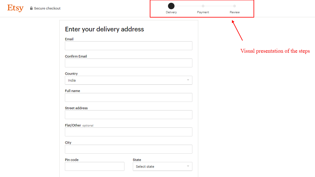
Example 1
Etsy uses a simple multi-page checkout process that makes the next step clear:
- Eliminate a few pages if possible.
- Use more interactive options wherever possible.
- One-page checkouts are used by many websites, if possible. There are many pros to the single-page checkout if done correctly.
- You can also squeeze the whole checkout process into a one-step checkout too, but that’s best done under the supervision of expert A/B test developers.
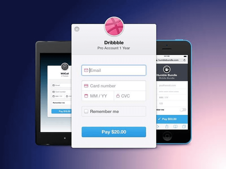
Example 2
Dribbble uses a one-page checkout process:
 Source: Dribbble
Multipage vs. single page checkout is a tough decision to make, as you’ll need to squeeze many steps into one. To know whether a user is responding positively or not, you can test it through checkout page A/B testing.
2. Provide Add-Ons at Checkout
It’s often a good idea to have a distraction-free checkout page. To utilize the added benefits of a simple page, related products are often used in the Add to Cart pop-up or page.
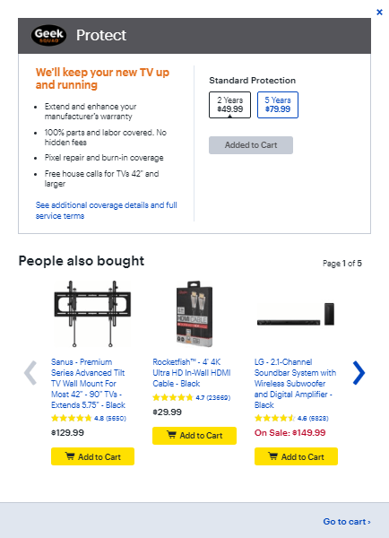
Example 3
Adding a television to the cart from Best Buy triggers a pop-up for a warranty, along with a suggested list of products users may need to install the TV unit — shown as “People also bought”:
To try a smaller version of this, test providing small add-on buttons on the cart page like food chains do. Add-ons, if designed well, can be less distracting yet allow users to more easily add things to their carts. This is a good way to upgrade sales by providing discounts, combos, etc.
3. Remove Distractions
When a visitor successfully transitions from a landing page to the checkout pages, it’s important to keep them focused. Remove all the extra links, discount strips, unnecessary navigation, etc. You want the user to only focus on making the purchase without having any second thoughts about it.
Monitor how your current visitors leave the website. Which links are they clicking before leaving? This not only helps you explore problem areas but also gives insight regarding the next checkout design, which should be dedicated to your users’ satisfaction.
Example 4
Glossier uses a minimalistic checkout page design:
After clicking on Proceed to Checkout, Glossier takes users to a specific checkout page that replaces the header, menu, and footer links with checkout-specific information. The same can be seen on the cart page, too. The design is also very simple with no special color scheme, but it still has all the necessary steps included — with no distractions or exit opportunities at all.
Experiment ideas to include in a checkout page design variation:
- Optimize the current design to be a minimalist checkout design, as a variation to the original web page (known as the “control” in experiments)
- Experiment with the color scheme
- Remove the header and footer link bars
- Upgrade to an even more simplified layout than you may already be using.
4. Forms: Experiment With Checkout Form’s Length and Design
Forms can take users by surprise. A neater form design is likely to convert more than a cluttered one, so have as few sections as possible. Visitors use online shops to save time — so form length shouldn’t be intimidating. They can delay the purchase if users don’t want to spend much time filling in the whole form.
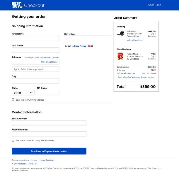
Example 5
Best Buy’s checkout form asks for the most important information only, which makes the checkout process look quick:
The options you can try testing include:
- Experiment with form length and design
- Provide fill-in options wherever possible, such as State, DOB, etc.
- Test eliminating a few extra form fields.
5. Sign-Ups vs. Guest Checkouts
Lead generation is one of the KPIs many websites use to keep their businesses in touch with their audiences. When a user clicks on a CTA such as Proceed to Buy on the Cart page, they are often required to sign up. This could be annoying if the user is in a rush. Having registration shortcuts such as signing up with Google, Facebook, and other accounts could be much more efficient from a user’s point of view.
Conversely, many online shops give users an option of Guest Checkout instead of making an account, only asking for an email to send the order confirmation to.
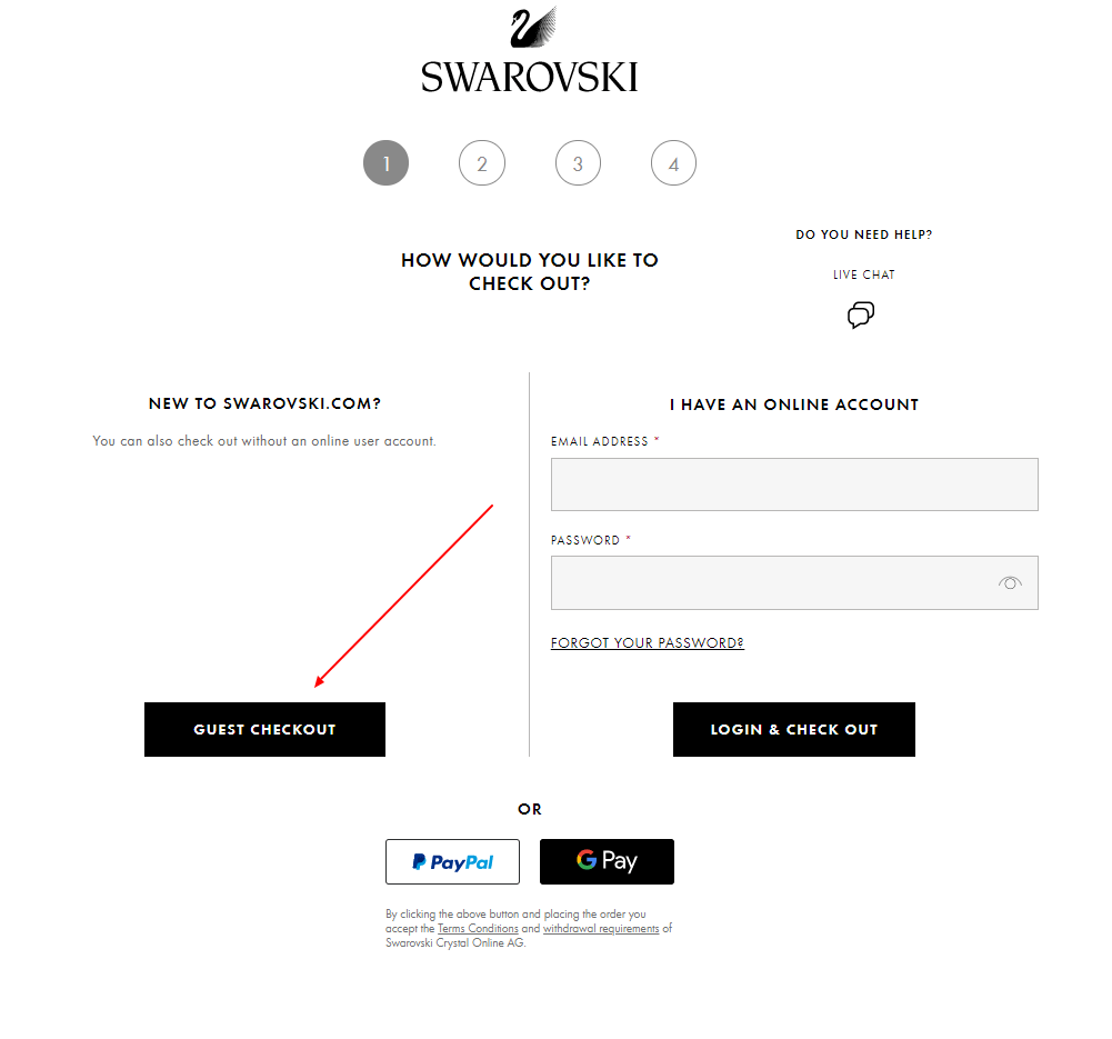
Example 6
Swarovski allows guest checkouts that enable users to skip the account creation step:
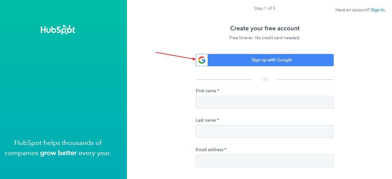
Example 7
Hubspot allows sign-up with Google. This way, users will only have to fill in their name and password:
Testing ideas for checkout:
- Sign-up before checkout vs. Guest checkouts
- Sign-up via Google, Facebook, and other information-validating websites.
Additional Best Practices for Checkout Page Optimization
Checkout optimization has so many possible design solutions based on devices, platforms, type of website, and availability of resources. But beside all of the options we mentioned above, there still are many other important elements that concern users and should be included with every checkout optimization process, whenever possible. We have picked few of them to highlight in this checkout optimization best prcatices section.
Below, we’ve gathered our most important best practices for items to always include with checkout process A/B testing. Keep these in mind while moving forward with experiments.
1. Provide Multiple Payment Methods
If you look back to the first image we used in this post, you can see a ranked list of the many reasons for abandoned checkout. On average, 8% of users drop out of purchasing due to a lack of payment options. Users may need payment methods besides credit cards to complete the purchase. It’s better to have as many popular options as possible to make purchases as easy as possible for every user.
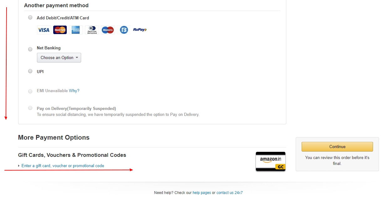
Example 8
Amazon provides many different payment options to users, including gift cards and vouchers:
2. Highlight Preferred Trust Badges
Users are likely to be skeptical about new websites. To make them feel comfortable sharing their card and address information, it helps to have a seal of approval. That way, they can make a purchase without having second thoughts.
Trust badges are a way of expressing that you have the required approval for delivery, card information, product quality, and any other necessary trust badges depending on the nature of your business. Baymard Institute shared a study showcasing which trust badges users prefer most:
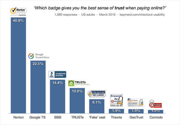 Source: Baymard Institute
You can research additional options to find out which ones may be applicable to your business.
3. Optimize CTA Buttons
Basic CTA buttons (such as Buy Now, Check Out, Proceed to Payment, etc.) are small, yet they’re the most important buttons responsible for conversions. You can and should experiment with the color, size, placement, font, and even the words used. That way, you can have the best CTA possible. Testing is necessary, as there are endless possibilities, so don’t just make assumptions on the basis of visuals. Structured data based on user responses to CTA changes will help you make the best decision for conversions.
4. Optimize for a Mobile-Friendly Checkout Process
According to mobile usability research from Google, 74% of mobile users are more likely to revisit a site that works well on mobile.
This directly implies that, while you want all your users to come back, you also need to target mobile users specifically. They probably share a good percentage of your conversions, so ignoring checkout optimization for mobile devices isn’t a good idea. Make changes toward a responsive checkout page for mobile devices with the help of A/B testing developers.
5. Present Shipping, Delivery, Returns, and Other Details Well
There are so many elements involved in the checkout process that it’s easy to leave some underrated information unoptimized. But these are some of the basic concerns of users before buying anything. If they can’t find them easily or are not sure about them, they’ll abandon their carts.
Some of those details to include in optimization testing are:
Shipping Costs
These are revealed at the checkout page only. You can experiment with placement, wording, color, and disclaimers (such as “Add $5 more for free shipping”).
Delivery Time
It can be a mystery whether to reveal an estimated delivery time before checkout completion or not, and sites which do not reveal it can seem suspicious to users. But if your site takes longer than usual for delivery, it may or may not disappoint customers. You may need to experiment with whether to reveal it or not. The placement, phrase used, color, and font should be tested also.
Return Policies and Cancellation Terms
A small link is usually used to navigate users to Return and Cancellation terms. Many users need to check these out before making any purchase. They shouldn’t pop out and distract the user, but they should be visible enough for the user to easily find them.
These are some of the most important elements to include. There still are enough possibilities as optimization does not have limits when it comes to creativity. We hope this information gave you something to get started with for checkout optimization via A/B test experiments.
Conclusion
You’ll need an experiment to validate the hypothesis of any idea stated above. Same applies to any other idea to improve website design and user experience. Because it is not suggested to ruin any existing conversions on the basis of assumptions. Experiments will allow you to use A/B test experts’ skills to implement complex optimizations. If you need assistance with ab test development for checkout pages — or any other page — let us know.
Brillmark is a team of developers which provide A/B testing solutions for all kinds of websites, regardless of device, platform, testing tool, etc. Find out more about our process of A/B testing for our clients.