You’re feeling motivated and inspired, so you check your analytics for the sales number, only to discover that hundreds and thousands of customers have abandoned their purchases.
How did this happen?
You spent numerous hours developing, optimizing, and A/B testing your online store, right?
You felt ecstatic and delighted, convinced that this would increase your conversion rate.
However, this was not the case.
Here is a sad reality.
Your website’s daily traffic may increase, but all of your efforts will be useless if you cannot turn them into paying customers.
Did you know?
According to the data collected by Baymard Institute, it is analyzed that over 60% of the buyers leave the shopping carts without completing the purchase.
It is disappointing that many leave before completing the purchase and will not return to finalize the purchase until you offer an incentive.
Most of the time, when we at Brillmark talk about their ecommerce store objective, they pinpoint that one of their objectives is to win back potential clients.
However, we always believe that they must also focus on preventing them from leaving in the first place.
This article mentions top strategies to improve your checkout process to decrease cart abandonment and increase conversion rates.
Once you are able to avoid these conversion-killing rogues from driving away your clients, your conversion rates and overall sales, from new to returning customers, will grow.
So let’s delve in and determine how you can accomplish this.
Checkout Conversion Killers to look out for
Low-Key shopping cart button
You’d be shocked at how frequently a consumer browses your business, selects an item, and adds it to their basket, only to forget about it 15 to 20 minutes later.
Typically, the problem is an underemphasized shopping cart button that does not draw attention to itself.
It should be clear to any website visitor that they have placed an item in their shopping cart.
Creating a brief animation or a pop-up that displays the cart’s contents and a “Checkout / Continue Shopping” call-to-action would be the most effective way to make a possible purchase unmissable to customers.
If you don’t want to write complex coding, the simplest method to make your shopping cart stand out is to make the changes to your cart count more obvious.
Effectiveness and load times
A sluggish website or mobile application fails to inspire the user’s trust or confidence.
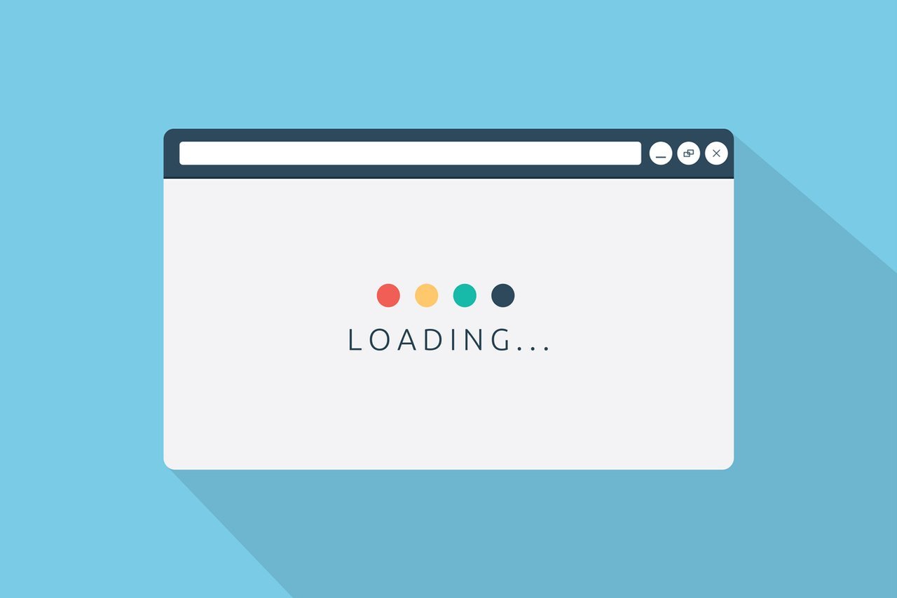
When the user experience is inadequate, people lack the confidence to make a purchase. If you’re on Shopify, this Shopify speed optimization guide shows easy ways to speed things up and keep shoppers happy.
The quality of the website and app consumers utilize, notably the purchase procedure, is crucial for converting users.
Regular end-to-end testing of the website, from the homepage to the checkout, is necessary to guarantee that consumers feel confident, secure, and comfortable completing transactions.
Load times, site or app speeds, and overall technical performance should be satisfactory to inspire client confidence and reliance.
Insufficient or Weak Product Specifics:
It’s simply profanity!
Can you envision a customer purchasing your goods without a persuasive and complete explanation?
Never mind that.
Shopping online can be an impersonal activity. But it doesn’t have to be!
The most effective technique to persuade a buyer to purchase is with interpersonal language and stunning visuals!
Start including captivating graphics in your product description to avoid alienating your buyers.
Required account creation procedure
Customers who must register or establish an account at the moment of payment frequently leave their shopping carts.
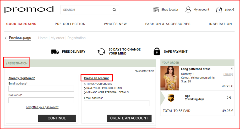
Adding an account registration may increase subscribers and users. However, it disrupts and slows down the payment process for consumers.
This eliminates the ease and the allure of quick online purchasing, partly because people utilize the website or app.
Forcing clients to sign up for an account before purchasing may negatively affect your conversion rates.
Ensure that your website allows clients to purchase as guests without registering.
Long and tedious registration forms
Before making a purchase, nothing is more annoying than having to fill out field after field of information.
Once a customer has decided to purchase, their main goal is to complete the process quickly and leave.
Concise registration forms are the best compromise.
Ensure that they have necessary dropdown menus, radio buttons, and an indication of which information is optional.
Maintain field labels so that clients may readily fill out the required information.
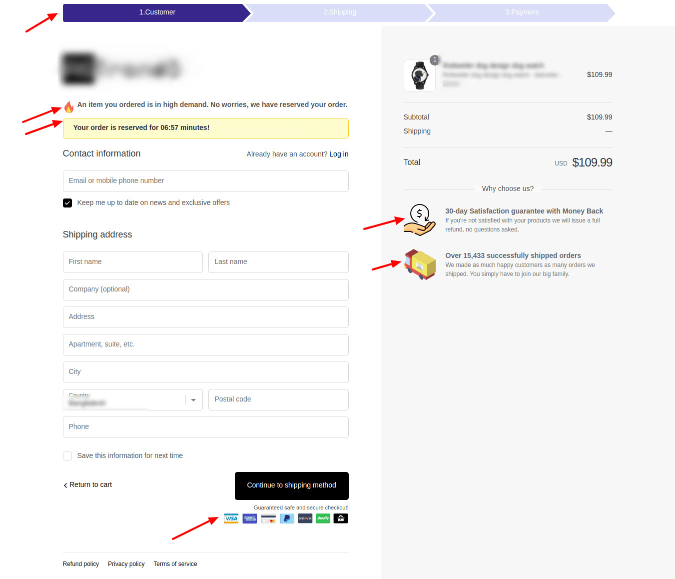
Unanticipated extra costs
Before beginning a transaction, customers like to know the entire cost.
Adding fees at the checkout step typically discourages individuals since they are now required to spend more than anticipated.
After considering the different prices, a consumer may return to complete the purchase, but additional charges at the checkout stage are generally sufficient to deter the client.
Be honest with your consumers.
Give customers an estimate of the total amount they anticipate paying at the checkout, including full pricing, shipping fees, and other potential expenses.
It is optimal to display these fees on the shopping cart page. This ensures transparency between the buyer and the website.
In general, avoid shocking clients with additional fees at the checkout step to decrease checkout abandonment.
Long & complicated checkout procedure
Online purchasing is intended to be quick, efficient, and convenient.
The longer the duration, the less convenient and enticing the service becomes to the customer.
If the checkout procedure is cumbersome and time-consuming, it will not save clients time or effort, and they will no longer see its value.
You must make your checkout procedure as easy as possible.
Ensure that the entire checkout procedure fits on a single page.
And please, no extraneous pop-ups encouraging the purchase of other things. They will do more harm than good to you.
Website failures and problems
Website faults and crashes are fundamental causes of shopping cart abandonment, as they prevent customers from completing their purchases.
Even if consumers can complete the transaction, sluggish speeds or mistakes undermine their trust in the payment system.
Moreover, it influences their view of the company’s capacity to fulfill the entire order, from sourcing to packaging to delivery.
If clients see faults early in the process, they will lose confidence and abandon the transaction.
Instead, consumers will likely purchase the product elsewhere.
There is no one-size-fits-all solution for technological challenges, but optimizing the website’s efficiency so that these failures do not reoccur is vital for preventing checkout abandonment.
Regularly test your website and watch its analytics to spot problems as they arise and maintain the app’s or website’s seamless operation.
Lack of reviews and testimonials
Most consumers are hesitant to make purchases from foreign or new companies.
Therefore, you will destroy conversions if you do not provide customer testimonials and favorable user evaluations on your website.
Using testimonials and user evaluations can establish credibility and gain customers’ confidence.
When someone observes that others have purchased from you and found your items beneficial, they are more inclined to do so themselves.
Payment safety worries
Payment security is of the utmost importance when operating an online business, as clients are only prepared to make transactions and enter financial information through platforms they trust.
People are cautious about entering personal information online, mainly financial information, for obvious reasons.
To preserve the security of user information, payment methods should incorporate fraud prevention.
It does not matter how excellent the security is, as many services have good protection; instead, it is more important to create a lasting impression of high-quality security.
Even if the service is safe, you must ensure it seems secure to the user.
Ensure consumers that they will not be squandering their money if they decide to purchase through your website.
Offer superior security throughout the user’s trip, especially throughout the payment transaction.
Ensure that the platform works effectively and that the available security is communicated to the user.
Hence, they know that the system provides essential safety to secure their data.
It is beneficial to place payment security stickers on the cart and checkout pages. This encourages users to make a purchase.
Additionally, it clarifies connections with reputable and well-known payment gateways and solutions (e.g., PayPal) since their logos are recognizable.
Insufficient payment options
A lack of payment alternatives is a physical barrier to completing a purchase.

Customers are more likely to abandon a purchase if they cannot access various payment options.
Customers will likely have access to various payment options and will probably choose the most convenient option.
As long as standard payment options are offered, this aspect is unlikely to affect checkout abandonment solutions as much as other variables.
Having as many payment choices as possible is the most effective countermeasure.
As payment methods are costly to supply, focusing on the most popular payment ways will address this issue for most customers while sacrificing just a few conversions.
Conclusion
Checkout is the most challenging stage for optimizing your online sales funnel.
In order to achieve optimum revenue, focus on eliminating the most significant conversion killers.
You will notice a more tremendous income increase than if you make little adjustments, such as changing the color of buttons or the wording of product descriptions.
We hope this post has helped you realize what is beneficial and essential for decreasing abandoned checkouts.
Always remember that your ultimate success rests heavily on the satisfaction of your clients.
Before implementing any changes, consider what consumers have said and how you can utilize their feedback to improve their experience and conversion rates.
A/B testing is a recognized technique for increasing the conversion rate of product pages.
It might assist you in avoiding making some basic errors that, if ignored, could have severe repercussions for your business.
The outcomes of A/B testing enhance the site and, consequently, the user experience.
The initial stage is to develop a detailed strategy for the endeavor, allowing for flexibility as needed.
Since our list of strategies should have sparked some ideas for your product pages, the next step is to put those ideas to the test through testing.
Initially, your internal staff may be able to handle testing, but as the complexity of your website increases, they may require assistance from an external source.
Therefore, it is advised to outsource the A/B tests, as dynamic A/B testing needs the support of expert engineers, UX designers, Q/A specialists, and others.
This must be addressed while avoiding the dangers of A/B testing in order to sustain consistent traffic.
Follow our recommendations to increase your conversion funnel and convert more visitors into paying clients.
Your future will be filled with greater conversions.
If you want assistance with A/B testing, building, or setup, please contact Brillmark. With the aid of our specialists, your team may achieve new accomplishments.
Companies that place a premium on specialized testing resources have relied on us to manage their tests for over a decade.
Whenever you are ready, contact us if you are interested in learning more.